If you’re into ink, there’s no better place to visit than Japan. Most independent stationery stores have their own house inks, if not their own entire lines, and it can quickly get overwhelming due to the sheer number of shops. The trick is to recognize that you can’t possibly collect them all (though some people inevitably try) and to enjoy exploring the different offerings without necessarily feeling pressured to buy all of them!
Four Maruzen inks, in basic colors of Blue, Blue-Black, Sepia, and Grey.
Store Inks I Picked Up On My Travels: Maruzen, Bungukan Kobayashi, Sessai, and Ancora
I spent a lot of time in Tokyo perusing the ink section of Maruzen, a large Japanese bookstore with an excellent selection of stationery. In addition to Maruzen’s own “Athena” line of inks, the Tokyo Station location carried a handful of inks made for Bungukan Kobayashi in Shizuoka, as well as the “Sessai” series made for Bungukan Tokizawa in Niigata. All three series are made by Sailor, who appears to make many store-exclusive fountain pen inks in Japan, though Tono & Lims is also gaining a larger footprint. (Some of these Tono & Lims inks are being released globally as well.)
Two inks from the Bungukan Kobayashi collection: Suruga Bay Night and Shizuoka Green Tea.
Two Sessai Inks. The one on the right is a subtle shimmer ink similar to the discontinued Iroshizuku Ina Ho.
The most unique ink I acquired was the “Rainy Day” ink from Ancora, Sailor’s flagship store. As you might guess from the name, Ancora only sells this ink in-store on rainy days, so we were lucky to be in Tokyo during the rainy season! In addition to the ink, Ancora also carries a Rainy Day fountain pen and matching converter.
Perceived Differences Between the U.S. and Japanese Ink Markets
While admittedly I have a limited perspective, not having explored beyond the major Tokyo stationery stores, I made a few observations:
The Japanese ink market focuses less on things like shimmer inks, super-sheeners, and other “special properties” that U.S. users tend to obsess over. While this is changing, and shimmer ink is gaining more of a foothold, Japanese versions tend to be more subtle and feature finer particles than you find in many U.S. and European brands. I also saw several instances where these inks were being marketed towards glass and dip pens, as opposed to fountain pens.
Colors in general tend to be more subtle and understated. Take the Maruzen Athena series, for example. The core colors are blue, blue-black, sepia, and grey. The Ancora Rainy Day ink is a shading blue with grey undertones (generally a popular color that you often see in Japanese ink lines). This is fine with me, as I appreciate inks that I can use everyday for office work, etc.
Many ink lines seem to have 5-10 colors, with new colors introduced gradually or rotated in and out as they are available. I don’t think I visited a shop where all of the colors were available at one time. Maruzen had about five of the Athena inks available for purchase, with others showing as out of stock. I guess I’ll have to come back to pick up the rest later.
A special ink needs a special pen, and vice-versa. I opted out of the Ancora Rainy Day Sailor - it appears to be a Pro Gear Slim with a steel nib - because it’s too small for my hand. But I did decide to pick up one of these Pilot Custom 845 Urushi pens, with a broad nib that shows off the shading.
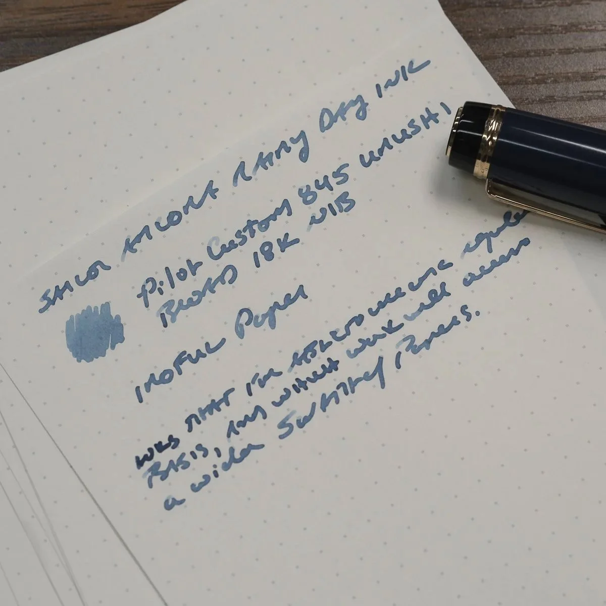
Depending on the light and paper used, the Rainy Day ink can appear as a shading mid-blue (MD Cotton swatches at top), or a true blue grey (which is what it looks like here on Iroful paper).
Ink shopping in Tokyo was a fun adventure and I’ll definitely be returning in the (hopefully near) future! Most of the inks I purchased are store-exclusive, meaning that they are only sold in-store and not online, so to get your hands on these you will either need to visit the shop yourself or have someone in Japan go in person to purchase the inks and ship them to you. Most stores attempt to avoid resellers, with Ancora limiting customers to three bottles per person. Even on a relatively busy rainy day, everyone there got to leave with a bottle of ink.
The Maruzen Athena ink bottle might be one of my all-time favorites. I love the classic pharmacy-style design.
Further Reading on my trip to japan
You can read more about my trip to Japan in prior posts, including this one discussing our visit to Kakimori (including a custom notebook and custom ink mixing experience), as well as some obligatory stationery shopping pictorials.
Please note that the inks featured in this post were acquired for my own collection or as gifts for friends and are not for sale. I will not respond to resale inquiries. The Gentleman Stationer is supported by online purchases from the T.G.S. Curated Shop and pledges via the T.G.S. Patreon Program. For more Japan store visits, haul posts, and just some general commentary and observations from a place I’ve never visited before, be sure to follow the TGS Instagram and YouTube accounts!