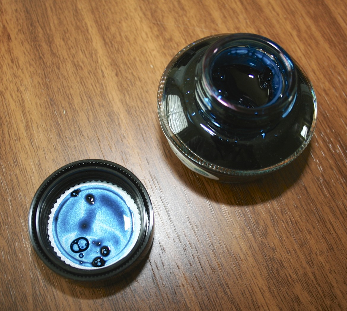
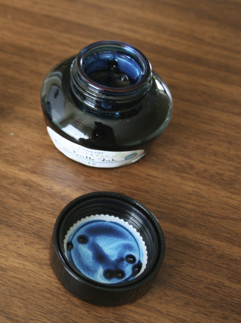
I was fully expecting to find this ink overrated, and thought it would be impossible for it to live up to the hype generated before its (re)release. I was wrong. While I love Miruai and Nioi-Sumire, Yama-Dori is probably going to end up being my favorite of the new Sailor Jentle line.
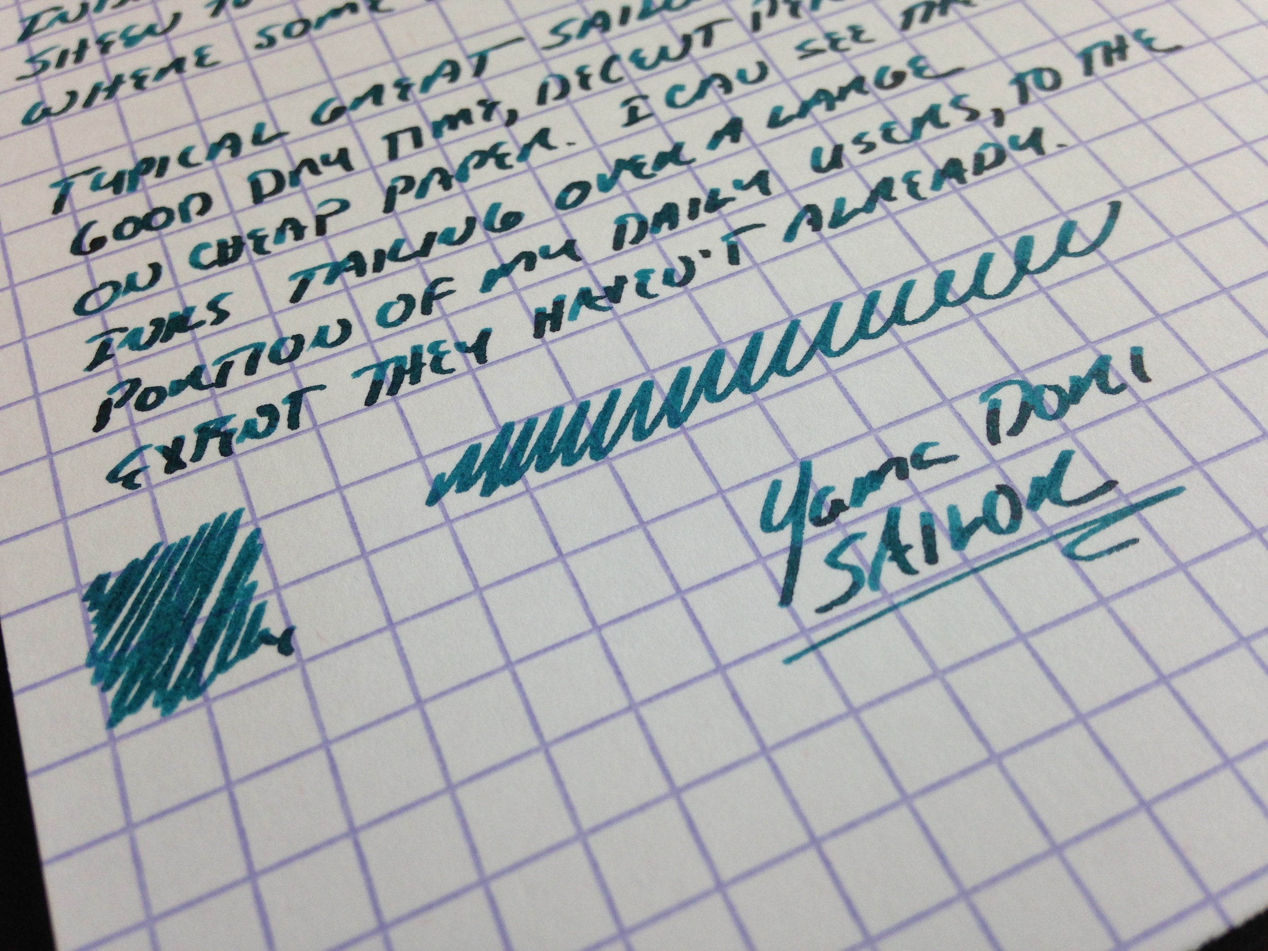
The color is a dark teal. Miruai could also be considered a very dark teal, but this ink has a different tone altogether because there's more blue in it. The color has a lot of subtle depth: there is some reddish sheen to the ink once it dries and you look at it from an angle, but it doesn't photograph very well (at least with my limited skill and equipment). You do, however, see a lot of shading with some black coming through where the ink is heavily applied to the paper.
In a way, the ink reminds me of a mix Pendleton Brown does (or did, before Organics Studio started making inks for him) called Blakwa, which I understood to be a 50/50 mix of Waterman Black and Waterman "Inspired Blue" ("formerly South Seas Blue," commonly known as "turquoise"). That mix didn't have the sheen, and wasn't as saturated, but I always thought it was a cool color.
Yama-Dori has all the properties of the Sailor Jentle ink line: good dry time, even on super smooth paper; low feathering and bleed-through, even on super cheap paper, and what I would call a very balanced level of color saturation. It's not watery ink, but it's also not super saturated to the point where it will smear. What I especially like about this ink is that it's an interesting color that is dark enough to use for work, or pretty much any other purpose.
Handwritten Ink review of Sailor Yama-Dori Ink on Exacompta card stock. The pen I used is a Pilot Vanishing Point with a Broad nib stubbed by Mike Masuyama.


Thanks to our sponsors at Pen Chalet for sending me this bottle. In full disclosure, I received this bottle for review purposes free of charge.