Skip to Content
  • Blog
  • Shop
  • Resources
  • FAQ (Ask TGS)
  • About
  • Archive
  • Contact
  • Sign In My Account
Menu

The Gentleman Stationer

Vintage Living in the Modern World.
  • Blog
  • Shop
  • Resources
  • FAQ (Ask TGS)
  • About
  • Archive
  • Contact
  • Sign In My Account

Ink Review: Color Traveler Shodoshima Olive Green and Mihara Daruma Red

September 15, 2021

I’ve always strongly believed that the best stationery brands - or at least my favorite stationery brands - are those that draw strongly on their own origins and sense of place when developing their brand identity and aesthetic. Color Traveler, an ink brand from Hiroshima, Japan-based stationer Tayama Bungu, is one of those brands. Like other boutique Japanese inks, the roughly 20 colors in the Color Traveler lineup are all named after regional “destination towns and their histories, special products and local goods, and other items which can accompany trips.” The two inks I’m reviewing today, Shodoshima Olive Green and Mihara Daruma Red, are perfect examples: the olive green is named after Shodoshima island, described as the first locale to successfully grow olives in Japan; the red is named after Mihara City, Hiroshima, which is famous for the production of Daruma, a traditional Japanese doll known as a “symbol of tenacity and good luck.” (Note: I don’t read Japanese, so all of my background information is drawn from the Shigure Inks website, where I acquired these two inks.)

Shodoshima Olive Green

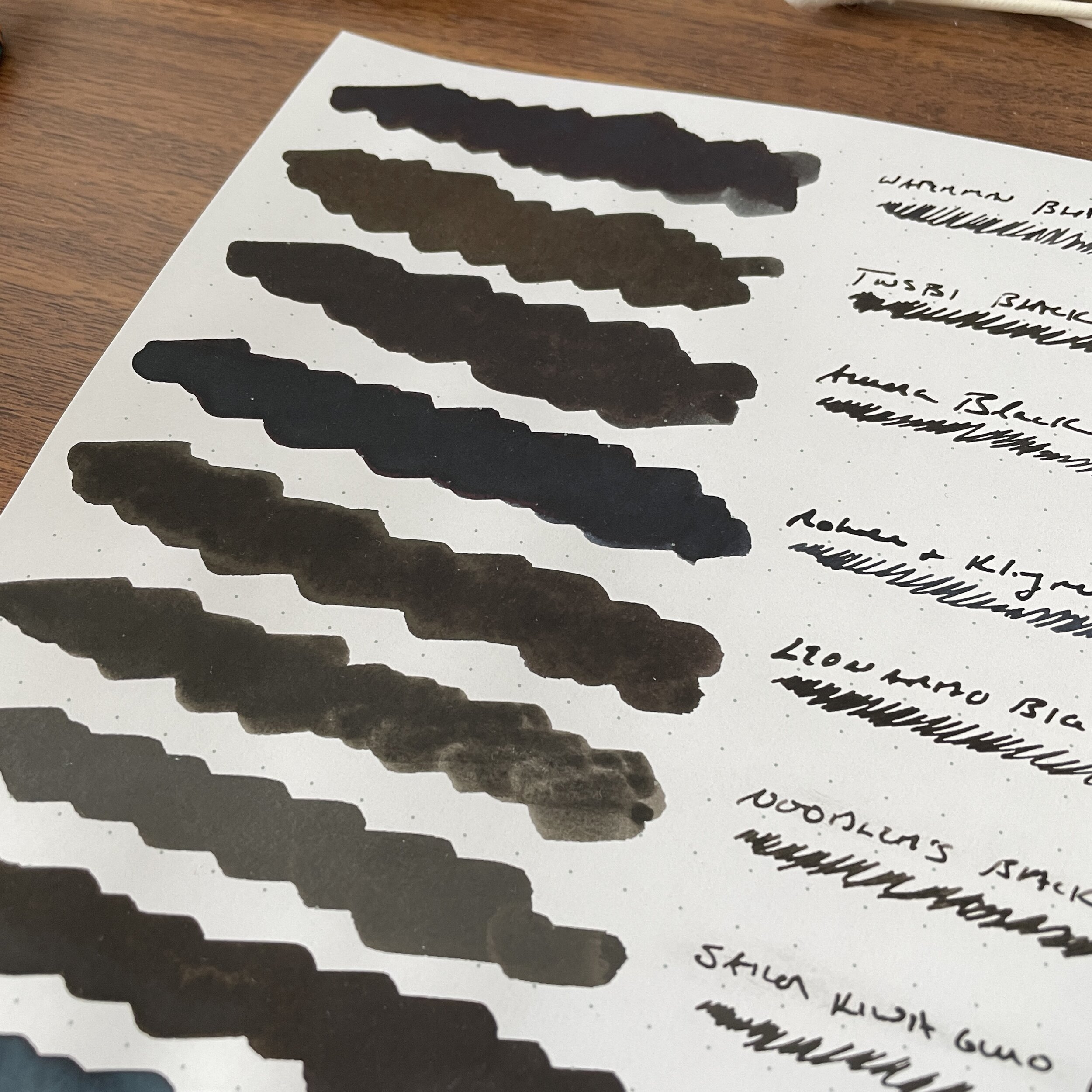
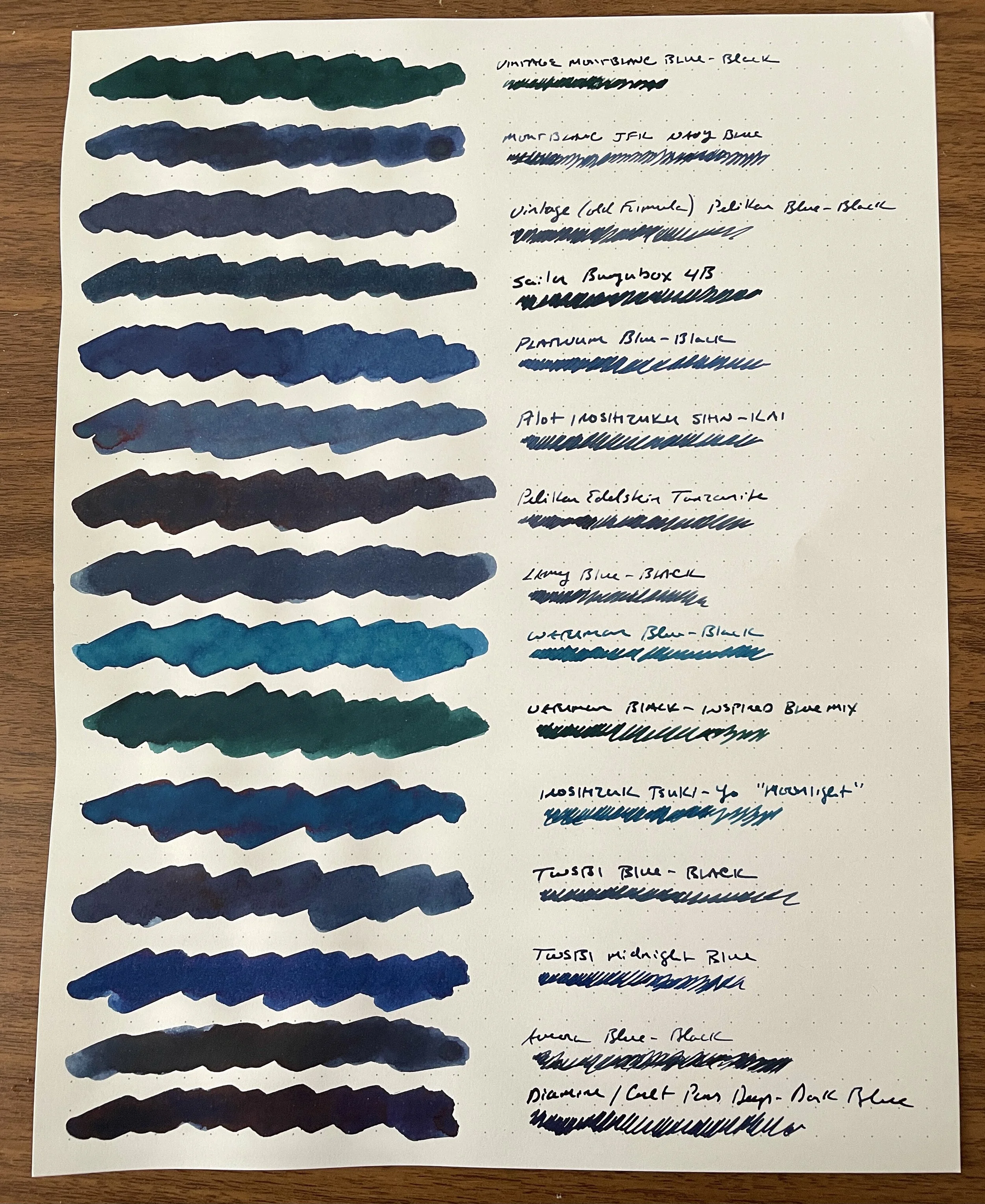
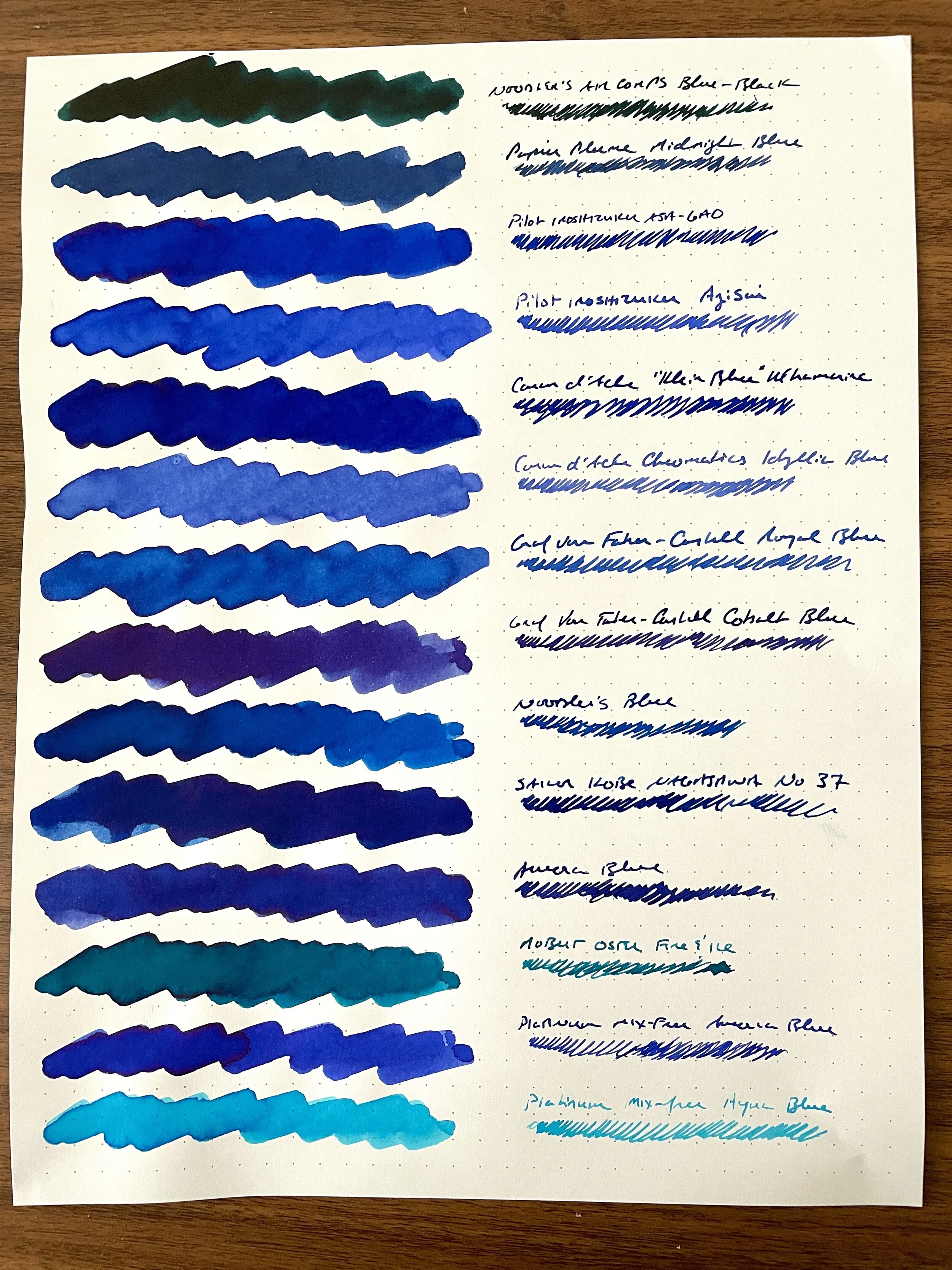
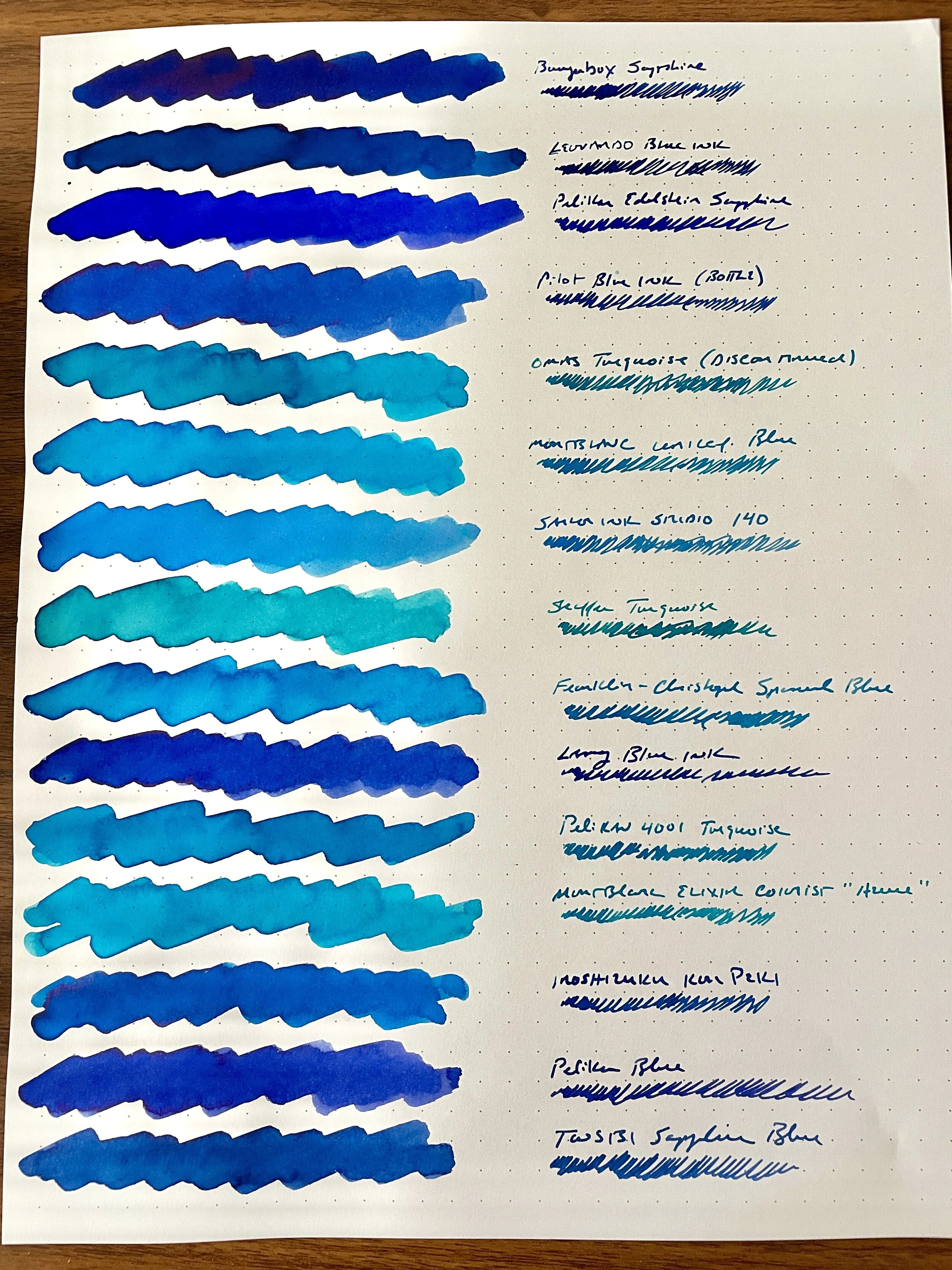
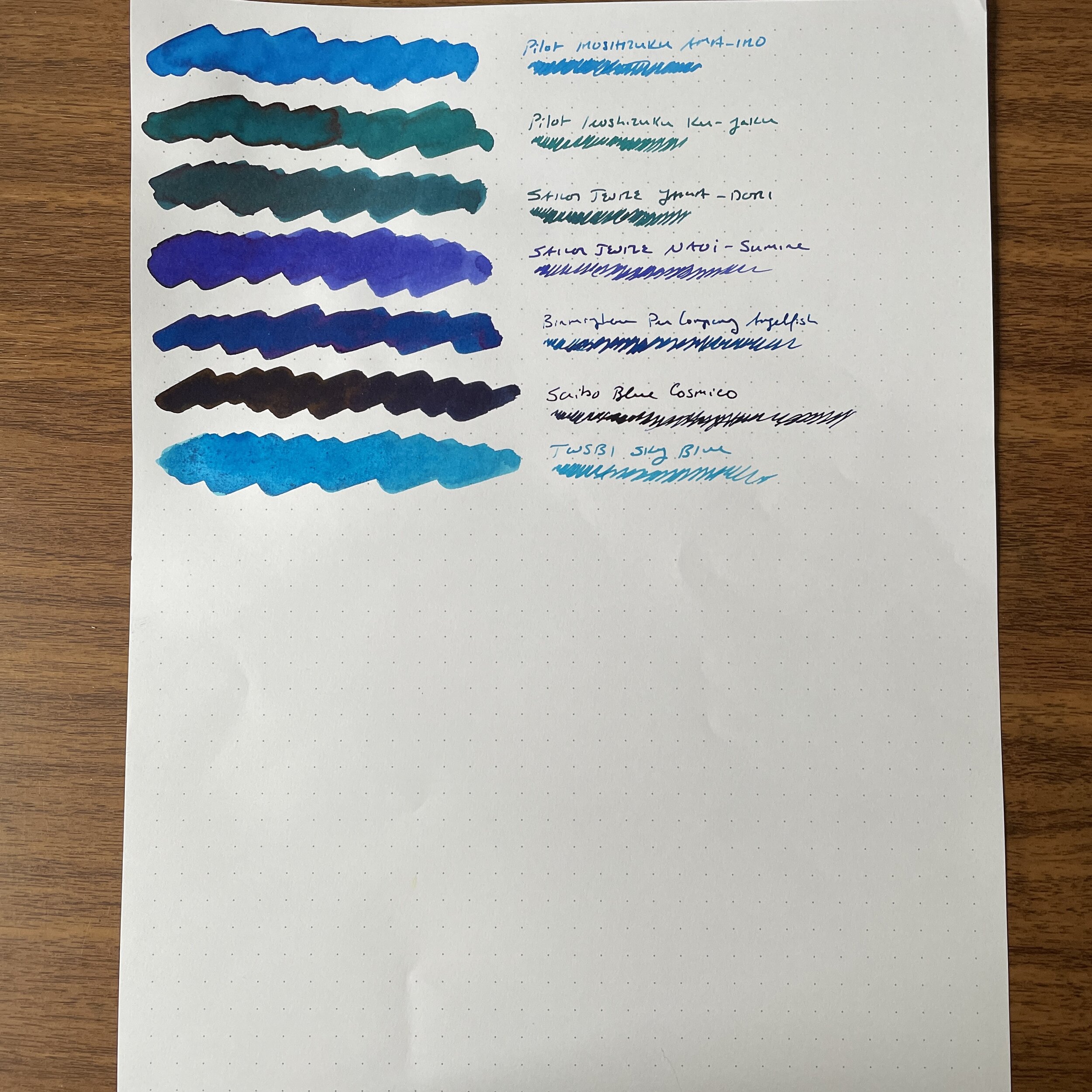
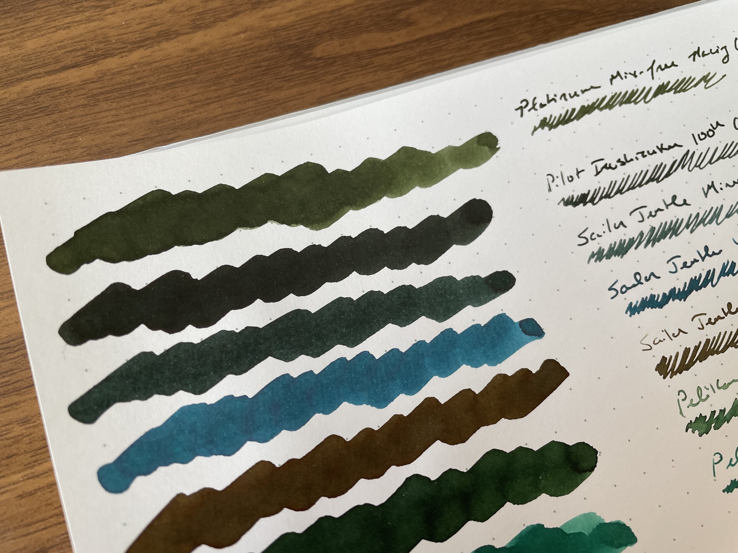
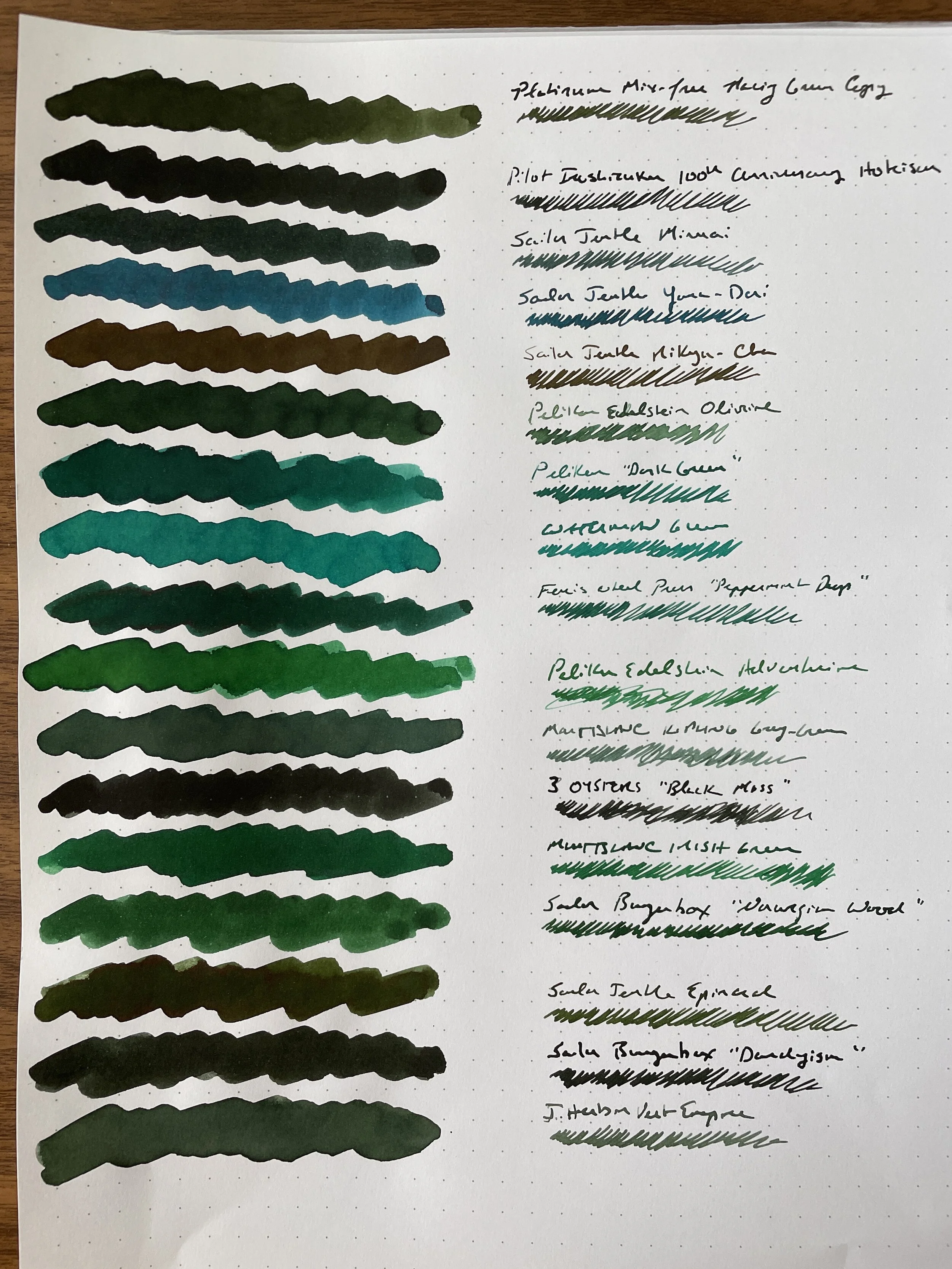
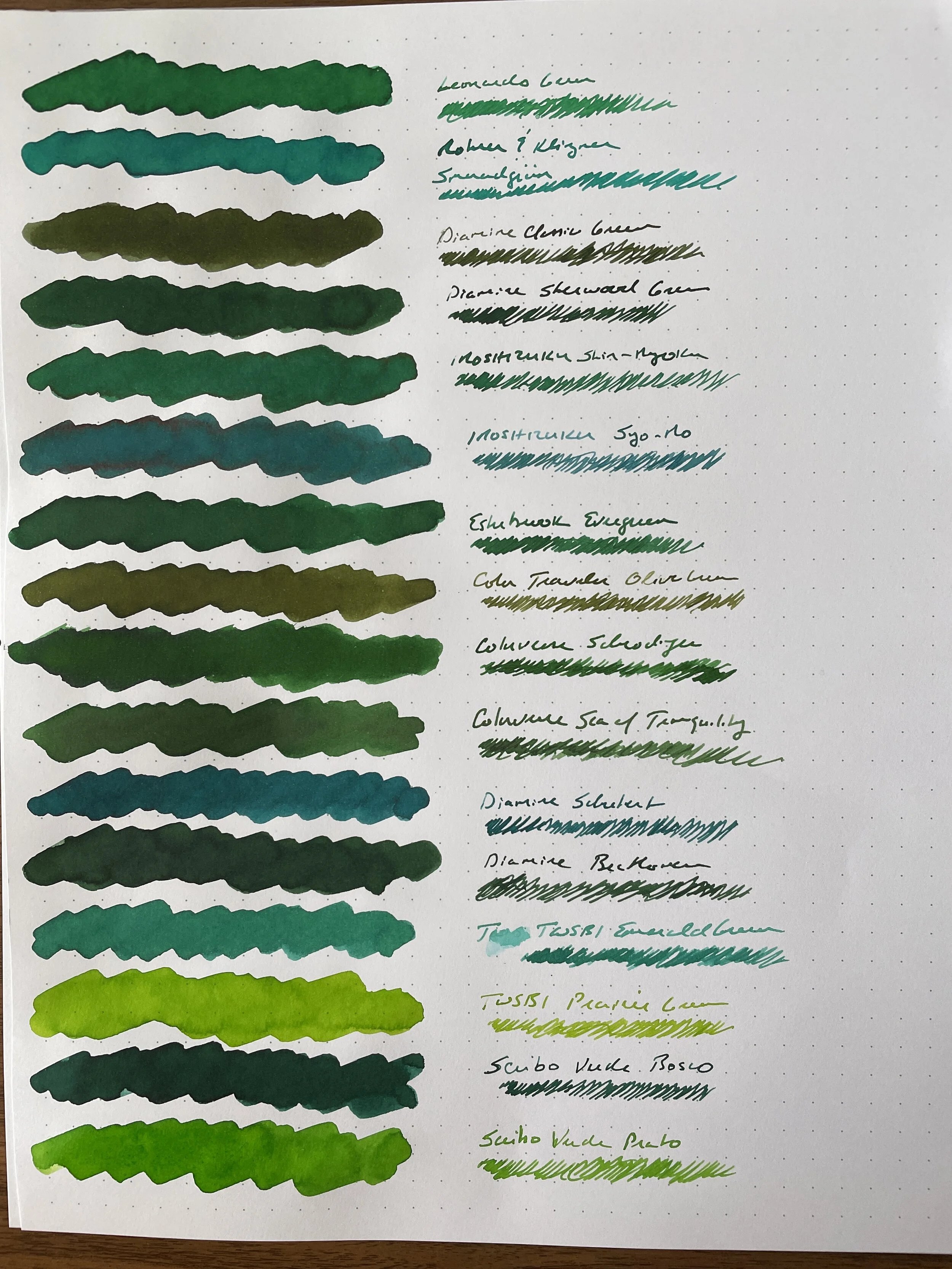
The olive green is easily my favorite of these two inks, which will come as a surprise to most readers since you know how much I enjoy writing with my reds. Olive green is a difficult color to get right - it’s typically either too yellow and pale, in which case it ends up barely legible, or it’s too dark, in which case it’s not really an olive green. Color Traveler nailed the tone, plus the ink shades nicely, dries quickly, and is generally well-behaved, even in a broader, wetter nib. If you’re interested in seeing how this green compares to others, you can check out my green ink comparison here.

I used two pens for my ink testing: a Leonardo Momento Zero Grande with a 14k medium (a very wet writer), and a Sailor 1911 Black Luster with a fine nib. I swapped both inks between these two pens, and the combination shown here worked the best for reasons discussed below. All ink samples in this review are done on bright white Write Notepads paper.

Mihara Daruma Red

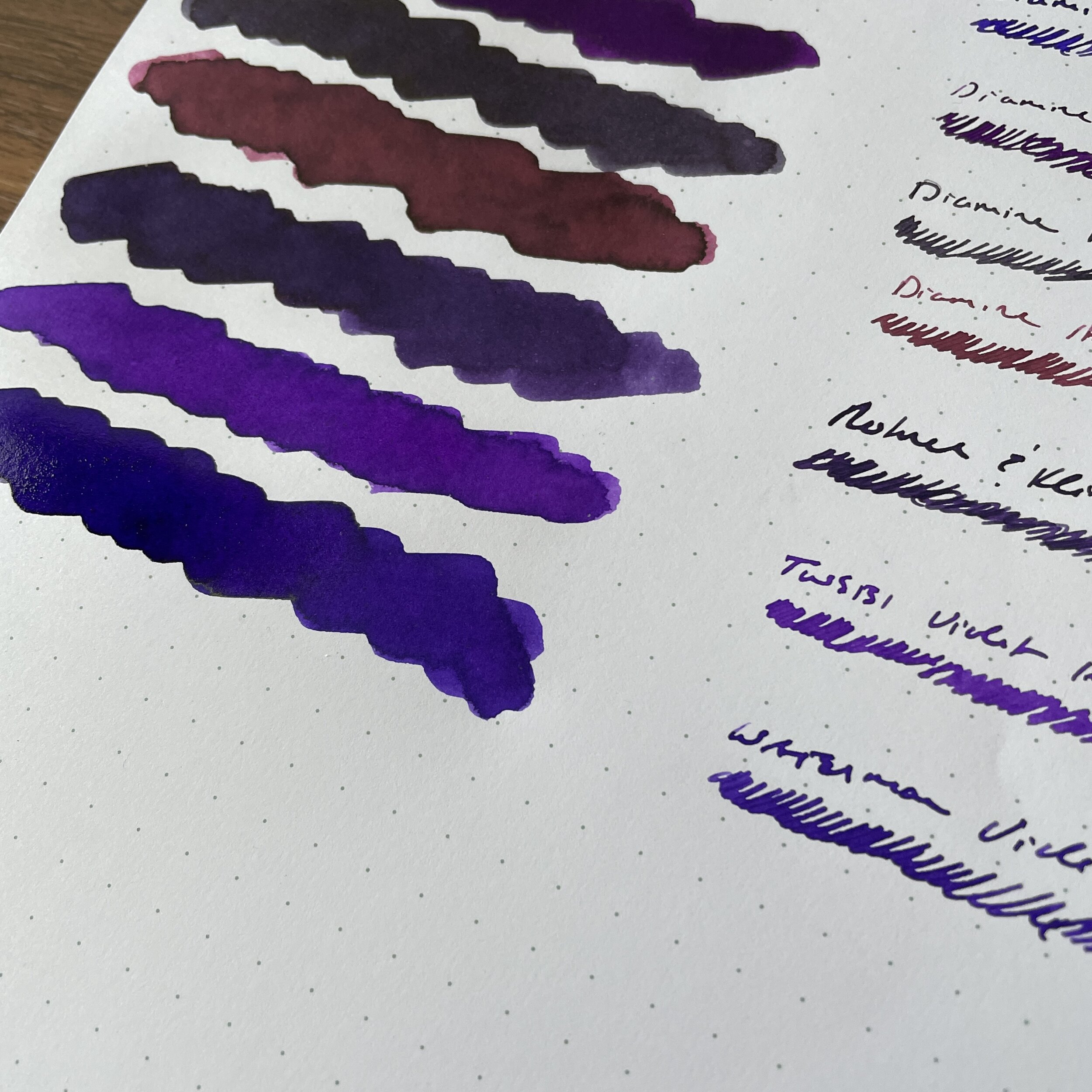
My experience with the Mihara Daruma Red was a bit more mixed. While a gorgeous color that strikes me as a dead ringer for the now-discontinued Montblanc Corn Poppy Red, in a broader nib I experienced extremely slow dry times and some smearing/tackiness up to an hour later. When I swapped the ink into a Japanese fine, I had no problems, but be warned if you like broader, wetter writers. Since the Shodoshima Olive Green dries quickly, I’m curious whether the slow dry time is unique to the dye used in the red ink, or whether other colors in the Color Traveler lineup have the same issue. If you know, please drop me a line or leave a comment. To see how this particular shade of red compares to others, you can check out my red ink comparison here.

Color Traveler inks come packaged with a small glass sample vial and a pipette.

Packaging and Overall Takeaways

Apart from the Mihara Daruma Red’s slow dry time, I had no other issues with these two Color Traveler inks. Neither bled or feathered on good paper. Moreover, the packaging/presentation are top notch, with an aesthetic similar to Colorverse. Each bottle of Color Traveler ink ships with a smaller vial for sampling/sharing, a pipette for pulling ink samples or filling an eyedropper fountain pen, plus some stickers. While not a huge selling point for me personally, I can see how the packaging and included extras could serve to raise the brand’s profile in an ink market that’s growing increasingly crowded.

I purchased the ink featured in this review from Shigure Inks, and paid full retail price. At $20 per 30ml bottle, I would say that Color Traveler is fairly priced for an imported Japanese ink, and in line with other similar brands such as Lennon Tool Bar and Tono & Lims.

Disclaimer: This post does not contain affiliate links, nor have I been compensated in any way for this review. Going forward, T.G.S is supported entirely by purchases from the T.G.S. Curated Shop and the T.G.S. Patreon Program, which offers access to online meetups, exclusive discounts and pre-orders, and more!

In Ink Reviews Tags Ink Review, Color Traveler Ink
Comment

Mini Collections, Part VI: The Rest of the Inks - Blacks, Greys, Browns, Oranges, and Golds

September 4, 2021

For the last round of ink swabs, I grouped together the five color families of which I have the fewest colors: blacks, greys, browns, oranges, and golds. Of these five, I have the most black inks, followed by browns, then oranges, with greys and golds bringing up back end. What was interesting is that after swatching all of these various inks, the colors I like the most are the greys and the golds - inks I’ve discovered recently and plan to work into my primary rotation.

View fullsize Black Inks
View fullsize Grey Inks

Key Takeaways and Conclusions

  • Black Inks. I always have appreciated, and continue to appreciate, a good black ink. But not a solid black, which I find boring. Most black ink enthusiasts know that black inks come in a variety of shades - some have blue, purple, or red undertones, and others dry to a matte finish. the closest ink to a “pure black” in my collection is classic Aurora Black, and while the color is a touch boring to me, it still gets a fair bit of use since it’s such a well-behaved, safe ink, especially for vintage pens. Other favorites include Waterman Black (red undertones), Lamy Black (purple undertones), and Roher & Klingner Leipzeiger Schwartz (blue-green undertones). Some people love Noodler’s Black and Sailor Kiwa-Guro for their waterproof qualities, but in my experience these black inks tend to smear since they are pigmented. I will likely keep the Kiwa-Guro for specific use cases since it smears the least.

  • Grey Inks. This is where things got interesting. For years, I found all of the grey inks I tried too thin and watery, with the writing barely legible on the page. Recently, however, I’ve discovered several that I enjoy quite a bit. Scribo Grigio is a dark grey with strong steel blue undertones. Vinta Armada is another multi-shader with a blue, green, and even red undertones, depending on the light, and Ferris Wheel Press Madam Mulberry is probably the best purple/grey I’ve ever used. (This latter ink could easily have been included in the purples as well, but since I only recently acquired it I had to group it here.) I don’t currently plan to get rid of any of my grey inks at this time. I’d also appreciate any suggestions for new greys to try!

  • Brown Inks. I strongly prefer dark brown inks, and pass on the lighter browns or reddish brown shades. Of this batch, I plan to keep the Montblanc Sand of the Desert (from the St. Exupéry collection), Scribo Classico Seppia, and Montblanc Toffee Brown. All of the others will go into the ink sale. I’ve really tried to get into brown inks but the color family, on the whole, just doesn’t appeal to me.

  • Orange Inks. Pelikan Edelstein Mandarin surprised me the most, with not only its color but its ability to shade. It’s a keeper, as are the legendary Sailor Jentle Apricot and Scribo Arancio di Sicilia. Diamine Deep Dark Orange is the perfect “blood orange” shade, and will stay in the collection for that reason. I’m still thinking on the others, but I doubt they will get enough use to justify keeping them even though they are great inks that survived prior orange ink purges.

  • Gold Inks. I only have two at the moment, and don’t know whether this category will continue to grow. The two inks I have I really enjoy: Vinta La Paz and Ferris Wheel Press Goose Poupon, both of which are gold inks that lean bronze (La Paz) and green (Goose Poupon). I typically go for darker golds, since they tend to be more legible. The number of colors in this particular range are somewhat limited, so I’m not sure there’s enough variety here that would justify accumulating more.

Ink Clearance Update and Further Reading

I plan to clear out excess inks that I don’t plan to keep in the same way I’ve been doing it. Watch the “Gently Used” Page in the coming days, as I cycle inks through the Patreon first and then move them over to the public page after a week. Some bottles still remain from my prior ink testing marathons, along with vintage pencils and office supplies that I’m clearing out. If you missed the earlier installments in this series, you can check them out below. My attention now turns to figuring out how to archive these posts for future reference, and how to update them.

  • Mini Collections, Part II: All the Red Inks

  • Mini Collections, Part III: All the Green Inks

  • Mini Collections, Part IV: All the Purple Inks

  • Mini Collections, Part V: All the Blue Inks (Including Teal and Turquoise)

For all of these ink samples, I’ve used standard q-tips to swab the inks, plus this glass dip pen to do the writing samples. The paper shown here is Write Notepads Dot Grid Memo Pad Paper, which as you can tell is exceptionally ink friendly and relatively inexpensive.

Disclaimer: This post does not contain paid affiliate links. Going forward, T.G.S is supported entirely by purchases from the T.G.S. Curated Shop and the T.G.S. Patreon Program, which offers access to online meetups, exclusive discounts and pre-orders, and more!

In Ink Reviews Tags Inks, Ink Review
2 Comments

Mini Collections, Part V: All The Blue Inks (Including Blues, Blue-Blacks, Teals, and Turquoise)

August 14, 2021

I have way too many blue inks, and need to do some serious housecleaning. Part of this, of course, is by default. Over the years I’ve purchased many pens that ship with a bottle of ink, and nine times out of ten, it’s a bottle of “house brand” blue or black. But at the same time, I’ve fallen into the habit of constantly searching for that perfect shade of blue, even though we all know that’s impossible. I’ve accumulated dozens of blues, many in nearly identical shades, without realizing it.

It goes without saying that I’m going to be selling off a lot of the duplicative bottles very quickly, as those are no-brainer choices to let go. Some of the rest, however, are more difficult. Here are my takeaways from this latest round of swabbing inks:

A General Note:

  • I found the blue inks more difficult than the other color ranges to photograph correctly, especially where you have shades of standard blue, turquoise, and blue-blacks together, and where certain supposedly “blue” inks tend to lean heavily green or teal. The blue-blacks are represented fairly accurately here. Otherwise, these photos tend to slightly overstate the vibrancy of the standard blues and understate the vibrancy of the teals and turquoises.

From Top: Vintage Montblanc Blue-Black; Montblanc JFK Navy Blue; Vintage Pelikan Blue-Black; Sailor Bungubox 4B; Platinum Blue-Black; Pilot Iroshizuku Shin-Kai; Pelikan Edelstein Tanzanite; Lamy Blue-Black; Waterman Blue-Black; Waterman Black-Inspired Blue Mix; Pilot Iroshizuku Tsuki-Yo; TWSBI Blue-Black; TWSBI Midnight-Blue; Aurora Blue-Black; Diamine Cult Pens Deep-Dark Blue.

With Respect to Blue-Black Inks:

  • I’m much more of a “midnight/navy blue” person than a steel blue, iron gall fan. I intend to move on from inks that essentially dry grey. Farewell, vintage Pelikan Blue-Black, Lamy Blue-Black, Iroshizuku Shin-Kai, and others that have very little actual blue in them.

  • I’ll probably keep at least one or two bottles of iron gall ink in the collection because it works so well on cheap paper and I sometimes like to use them for work. I don’t need six bottles though, and TWSBI Blue-Black is an inexpensive favorite.

Blue-Ink-Volume-2.jpeg

From Top: Noodler’s Air Corps Blue-Black; Papier Plume Midnight Blue; Pilot Iroshizuku Asa-Gao; Pilot Iroshizuku Ajisai; Caran d’Ache “Klein Blue” limited edition; Caran d’Ache Chromatics Idyllic Blue; Graf von Faber-Castell Royal Blue; Graf von Faber-Castell Cobalt Blue; Noodler’s Blue; Sailor Kobe Nagasawa No. 37; Aurora Blue; Robert Oster Fire & Ice; Platinum Mix-Free Aurora Blue; Platinum Mix Free Aqua Blue.

With Respect to “Standard” Blue Inks:

  • Standard Pelikan, Lamy, and Pilot blue inks are far too washed out to warrant taking up space in the collection. If you’re a serious vintage pen collector, which I’m not, you may prefer one or more of these “safe inks” for use in your more delicate pens prone to staining, but it’s not an issue I face, and in any event I prefer Waterman Florida (“Serenity Now”) Blue.

  • Aurora Blue remains a favorite inexpensive blue ink. Noodler’s Blue is also very good, and I’ve found it to be better behaved than other Noodler’s colors. It also dries fairly quickly and doesn’t smear. (At least, the bottle I have doesn’t. As with most Noodler’s ink, there are batch variations so YMMV.)

  • The Pilot Iroshizuku line has the best blue inks across the board of any ink line on the market. I could happily live in this ink lineup forever. Asa-Gao, Ajisai, and Kon-Peki are exceptionally vibrant blue inks that have become staples in my rotation.

  • I don’t like Sailor blues as much as I used to. I don’t find them as vibrant as the Pilot inks, and even Bungubox Sapphire (which I used to think was the best blue ever) can’t hold a candle to Asa-Gao, IMHO. The ridiculous price point of the Sailor Bungubox inks make this an even easier call.

From Top: Bungubox Sapphire; Leonardo Blue; Pelikan Edelstein Sapphire; Pilot Blue; Omas Turquoise; Montblanc UNICEF Blue; Sailor Ink Studio 140; Sheaffer Turquoise; Franklin-Christoph Spanish Blue; Lamy Blue; Pelikan 4001 Turquoise; Montblanc Elixir “Azure”; Pilot Iroshizuku Kon-Peki; Pelikan Blue; TWSBI Sapphire Blue.

With Respect to Teal and Turquoise:

  • The big winner from this round of swatching is once again an Iroshizuku ink. Ama-Iro, which I’ve never used before, is absolutely gorgeous. A close second is the standard Pelikan 4001 Turquoise, which also shocked me with its vibrancy.

  • Iroshizuku Ku-Jaku over Sailor Yama-Dori. Again, Pilot also wins in the category of “dark teal inks with shading.”

  • Many turquoise inks are too watery for my taste. The one lighter ink I may make an exception for is Sailor Ink Studio 140, since it’s a relatively rare example of a “double shader” that is legible enough for everyday writing.

From Top: Pilot Iroshizuku Ama-Iro; Pilot Iroshizuku Ku-Jaku; Sailor Jentle Yama Dori; Sailor Jentle Naoi-Sumire; Birmingham Pen Company Angelfish; Scribo Blue Cosmico; TWSBI Sky Blue.

So. Many. Blue. Inks.

View fullsize Blue Inks, Vol. 1
View fullsize Blue Inks, Vol. 2
View fullsize Blue Inks, Vol. 3
View fullsize Blue Inks, Vol. 4

As always, watch the “Gently Used” Page in the coming weeks. I plan to aggressively unload some of these inks, cycling them through the Patreon first and then move them over to the public sale page after a week. Some greens and pinks still remain from my prior ink testing marathons, along with vintage pencils and office supplies that I’m clearing out.

Disclaimer: This post does not contain paid affiliate links. Going forward, T.G.S is supported entirely by purchases from the T.G.S. Curated Shop and the T.G.S. Patreon Program, which offers access to online meetups, exclusive discounts and pre-orders, and more!

In Ink Reviews Tags Ink Comparison, Inks, Ink Review, Blued Inks
7 Comments

Mini Collections, Part IV: All the PURPLE Inks

July 31, 2021

I’ve decided to push through, and to post my ink inventories consecutively, as opposed to stretching these posts out over the coming months. (As I previously mentioned, I’m focused on really paring down the amount of ink that I have accumulated, and this is the most effective way to compare the various colors and decide what I like and what I can move on from.) Next up are the purple inks, a color that’s less represented in my collection in terms of number of bottles, but which is still one of my favorite “fun” colors to write with, especially for annotation purposes.

Of course, the one that everyone wants to see is Lamy “Dark Lilac,” with Montblanc “Beatles Psychedelic Purple” a close second. So these are the top two inks on the sheet. The bottom two, leaning more heavily blue, are Colorverse “Hayabusa” and “Hayabusa Glistening.”

You don’t need to spend a lot of money to get a great purple ink. Waterman “Tender Purple” (formerly “Violet”) is a bright, intense purple ink that I believe rivals many of the “cult” purples that command such a premium on the secondary market. TWSBI Violet is another sleeper, which I think approaches the tone of Montblanc Beatles Purple.

You don’t need to spend a lot of money to get a great purple ink. Waterman “Tender Purple” (formerly “Violet”) is a bright, intense purple ink that I believe rivals many of the “cult” purples that command such a premium on the secondary market. TWSBI Violet is another sleeper, which I think approaches the tone of Montblanc Beatles Purple with slightly less vibrancy.

View fullsize BFFDBF83-83CA-43FB-8562-131813B19F00_1_201_a.jpeg
View fullsize 56166DF9-CD8A-40D4-B596-3B79EB919C82_1_201_a.jpeg

Key Takeaways and Conclusions

I don’t use my purple inks as often as other colors, and even though I don’t have as many, I don’t really need what I have. Therefore, I’ve decided to make some hard choices to pare down the collection:

  1. After much consideration, I’m going to move on from a lot of the “popular” inks that I’ve accumulated over the years. While Lamy Dark Lilac and Montblanc Beatles Purple are great colors, I don’t use them enough to justify keeping them around when others will likely enjoy them more. These are going in the Patreon Sale today along with several others.

  2. The purple inks that I enjoy the most are the ones that aren’t very expensive. Waterman Tender Purple and TWSBI Violet can be had for a song, so there’s no need for me to have a ton of money locked up in (much) more expensive inks, some purchased at a premium on the secondary market, especially where there are relatively close equivalents should I occasionally want to write in that particular shade.

  3. For those looking for a substitute for Lamy Dark Lilac, consider picking up Diamine “Pansy” from the Flower Set, or Diamine Monboddo’s Hat, which I’ve not personally tried but many swear by as a close match. Montblanc Beatles Purple is a bit harder to duplicate. While the shade of purple is fairly common (it’s a bright violet), other inks have a hard time matching the vibrancy after the ink dries. Both TWSBI Violet and Iroshizuku Murasaki Shikibu have somewhat similar tones but don’t maintain the brightness when dry.

  4. I’m partial to purple inks that lean heavily blue, such as Colorverse Hayabusa and Diamine Iris (another from the exceptional Flower Set). Over time, I’ve become less enamored with very dark purples-black inks, such as Sailor-Bungubox Ink of Witch and the Lamy Dark Lilac. I guess tastes evolve.

Further Reading and Personal Ink Sale Details

If you missed the first installments of my multi-part ink comparison, check out my post on “All the Red Inks” here, and “All the Green Inks” here. (I have many more red and green inks in my collection than any other color, so these will be the most comprehensive.) Also, here’s how I’m handling my “ink liquidation”: All bottles that I decide to sell go into the Patreon sale page for a week, and anything that Patreon members don’t claim goes to the public “Gently Used” page, where I occasionally post stuff from my own personal collection for sale. I recently moved a bunch of green and red inks, as well as vintage pencils and other items, to that page. Though I am not an official retailer of any of the items listed, any gently used orders can be combined with Curated Shop orders to meet the free shipping threshold. I’m not looking to profiteer here - nearly everything is listed at below retail, and where a premium is charged, it’s for a bottle I had to work hard to get or for which I paid over retail on the secondary market.

Disclaimer: This post does not contain paid affiliate links. Going forward, T.G.S is supported entirely by purchases from the T.G.S. Curated Shop and the T.G.S. Patreon Program, which offers access to online meetups, exclusive discounts and pre-orders, and more!

In Ink Reviews Tags Inks, Purple Inks
1 Comment

Mini-Collections, Part III: All the Green Inks

July 24, 2021

Following last week’s ink-sampling session with all the reds in my collection, I decided that I would go through the greens next. While I have roughly 2/3 the number of green inks as I do reds in my ink archive, it’s probably the second-most represented color. My collection generally revolves around dark greens, mostly green-blacks or what would qualify as “racing greens”. (No, I don’t have the coveted “Montblanc British Racing Green” that was so popular many years ago, but I did make a copy using Platinum Mix-Free inks and a formula someone posted to FPN, so I include that for reference.)

The top ink is the “racing green” imitation/approximation made using Platinum mix-free inks. I have a few other inks that get generally close to that shade, discussed further below.

The top ink is the “racing green” imitation/approximation made using Platinum mix-free inks. I have a few other inks that get generally close to that shade, discussed further below.

View fullsize Green Inks: Sheet 1
View fullsize Green Inks: Sheet 2

Takeaways From the “Green Ink” Project

  1. In addition to the Platinum Mix-Free combination, Sailor Jentle Epinard is a long-time favorite and probably the closest ink in my collection to a true “Racing Green.” I definitely need to use that ink more. Diamine Classic Green and Color Traveler Shodoshima Olive Green are similar, but lighter.

  2. As with the reds, I have too many green inks and can absolutely part with some of these colors, including duplicate bottles and inks that lean heavily blue or teal. These will be added to the Patreon ink sale quickly and rotated to the public “Gently Used” page after a week.

  3. I really was surprised at the number of inks that were grouped as “greens” but really should be blues. Waterman Green, Iroshizuku Syo-Ro, and Rohrer & Klingner Smaragdgrun are the three that jump out the most. Sailor Yama-Dori really is characterized more as a teal blue that I swabbed with the greens by mistake.

  4. Overall, my favorite two brands for green inks at a reasonable price are Diamine and Colorverse. Diamine Classic Green and Sherwood Green are great colors I’ve recently added to my collection, and Colorverse Schrodinger and Sea of Tranquility have staying power.

  5. My overall favorite green ink for everyday writing? Probably a tie between the Sailor Epinard and Sailor Bungubox Dandyism.

As with the reds, I laminated the two green ink sheets and will have them with me at the D.C. Pen Show!

As with the reds, I laminated the two green ink sheets and will have them with me at the D.C. Pen Show!

Disclaimer: This post does not contain paid affiliate links. Going forward, T.G.S is supported entirely by purchases from the T.G.S. Curated Shop and the T.G.S. Patreon Program, which offers access to online meetups, exclusive discounts and pre-orders, and more!

In Ink Reviews Tags Ink review
3 Comments
← Newer Posts Older Posts →
Store Location
Visit the T.G.S. Curated SHOP
*New* Updated "Best Pens" Guide (2025)
TGS x Hinze Pens Violet Tendencies Taschenstift Fountain Pen
Hierarchies of Fountain Pen Friendly Paper
Allex Scissors arrayed on a desk showing link to desk accessories

Join Our Patreon!
Subscribe to the TGS E-mail List

Featured Posts

Featured
Yamamoto-Gray-Paper-Sampler-Set.jpeg
May 10, 2025
Discovering Unusual Paper: "Paper Tasting" Sets from Yamamoto Paper
May 10, 2025
May 10, 2025
Four-Micarta-Fountain-Pens.jpeg
Apr 19, 2025
Yes, Micarta for me! I finally got my hands on Some Micarta Pens, Plus My Own Special Edition
Apr 19, 2025
Apr 19, 2025
2025-Arkansas-Pen-Show-haul.jpeg
Mar 29, 2025
Unboxing the Arkansas Pen Show Haul! Two Nib Grinds, Inks, and a New Pen
Mar 29, 2025
Mar 29, 2025
The Gentleman Stationer RSS

© Digital Divide Media, LLC, 2014-present.

All content is the exclusive property of Digital Divide Media, LLC, d/b/a The Gentleman Stationer, including “The Gentleman Stationer” website and trademark, and should not be reproduced without express written permission.  All rights reserved.

All content containing paid advertising, affiliate links, or sponsored content will be plainly disclosed by a disclaimer when/if featured.

Contact Information

Store Shipping Policy and Return Policy

Privacy Policy

Cookie Policy

Terms and Conditions

Powered by Squarespace