While I publish an annual list of "Best Pen" recommendations, inks are far trickier, made especially difficult by the dozens of brands and thousands of different colors now available, which wasn't the case when I first started TGS. Over the years, I've done a few lists of my favorite inks for specific purposes, such as office use and annotation, but have shied away from anything more categorical. Then I had the idea: What if I made a list of my current preferred ink for each color category, which I could easily update over time? Here are the rules I came up with:
The ink has to be available. No limited editions that are impossible for people to find because that's no fun to read. (Those can have their own list, if people are interested.)
Broad color categories only with no sub-categories. Keep it simple. Here, I've organized this initial list with 12 slots that loosely tracks the major colors that pen companies typically include in their lineup.
I have to have used the ink in multiple pens over the past year. Some of these inks have been used more than others (brown and yellows don't actually get much time in my rotation), but generally, frequency of use + simple joy determines whether an ink makes the cut.
Here we Go! Fountain Pen Inks of Choice by Color (2023)
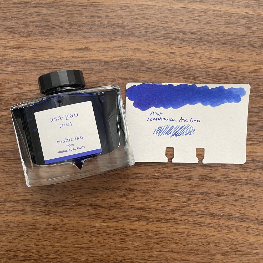
Blue: Pilot Iroshizuku Asa-gao. I sometimes go far too long without using this particular ink, but whenever I use it to fill a pen I wonder why I don't just keep a bottle of it on my desk. A bright royal blue that borders on "electric," but is still professional enough to use at the office. It reminds me of Waterman blue that doesn't fade to a duller color after drying.
Black: Lamy Black. When choosing a black ink, some go for the darkest line possible, but not me. I prefer some shading and undertones, especially the purple cast that Lamy Black has when it dries, which gives the ink added depth.
Blue-Black: Iroshizuku Tsuki-Yo. The name translates as "Moonlight", and though I can't exactly explain why, it fits this shade of ink perfectly. Tsuki-Yo leans more blue on the blue-black scale, and exhibits a slight red sheen on some papers. As one of the longest-running inks in my collection, which at the moment I have loaded into three pens, Tsuki-Yo might be my favorite of the Iroshizuku Inks and one of my favorite inks of all time.
Turquoise: Kaweco Paradise Blue. Some of you may be surprised to see two Kaweco inks on this list, but I absolutely love Kaweco's ink offerings and find them extremely underrated. The inks are vibrant, low-maintenance, and inexpensive, and the fact that they come in both cartridges and bottles ensures that you can use them in your Kaweco Sports as well as your piston fillers.
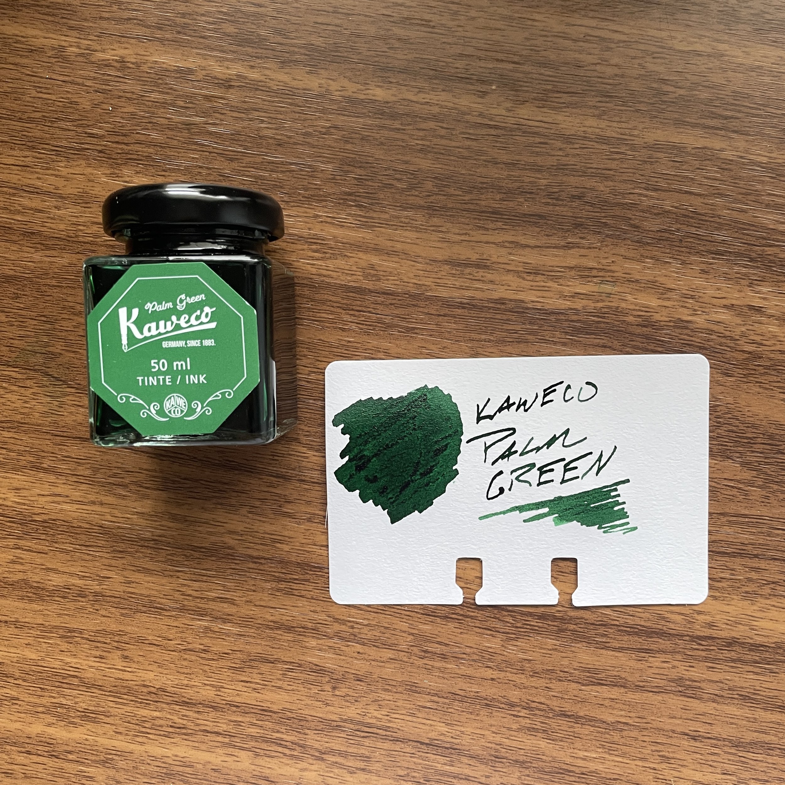
Green: Kaweco Palm Green. I consider Kaweco Palm Green to be of the most underrated inks of all time, not just in the Kaweco lineup. It’s a beautiful rich color that I use regularly even if it can take a bit of time to dry.
Red: Dominant Industry Romania Red. If you were going to have a blood-red vampire-themed ink, it would be this one. This bold, rich color flows well, dries quickly, and doesn't create nib crud. Vampire-themed inks cannot be “pink”, which seems to be a hot topic of conversation these days. Fight me ;)
Burgundy: Montblanc Burgundy Red. The hardest color for me to choose (since most of my favorite burgundy inks are limited editions). I finally went with standard Montblanc Burgundy Red. Though perhaps not as vibrant as some of Montblanc's special edition burgundies, it's a consistently good performer that's a favorite standby.
Orange: Laban Apollo Orange. This orange has been making its way through my orange and yellow TWSBI demonstrators for the past six months. Inspired by the Greek God Apollo, whose symbol traditionally is the sun, this is a “pure orange” ink with a slight tinge of red to help with the legibility.
Yellow: Anderillium American Goldfinch Yellow. The first yellow ink I've found that's truly legible, due to its gold/goldenrod hue, American Goldfinch Yellow can be used for actual writing in addition to highlighting and annotation.
Brown: Laban Demeter Brown. A dark brown, but not quite a brown-black. For my brown inks, I tend to enjoy the darker browns and sepias, because they take on a vintage look as they dry.
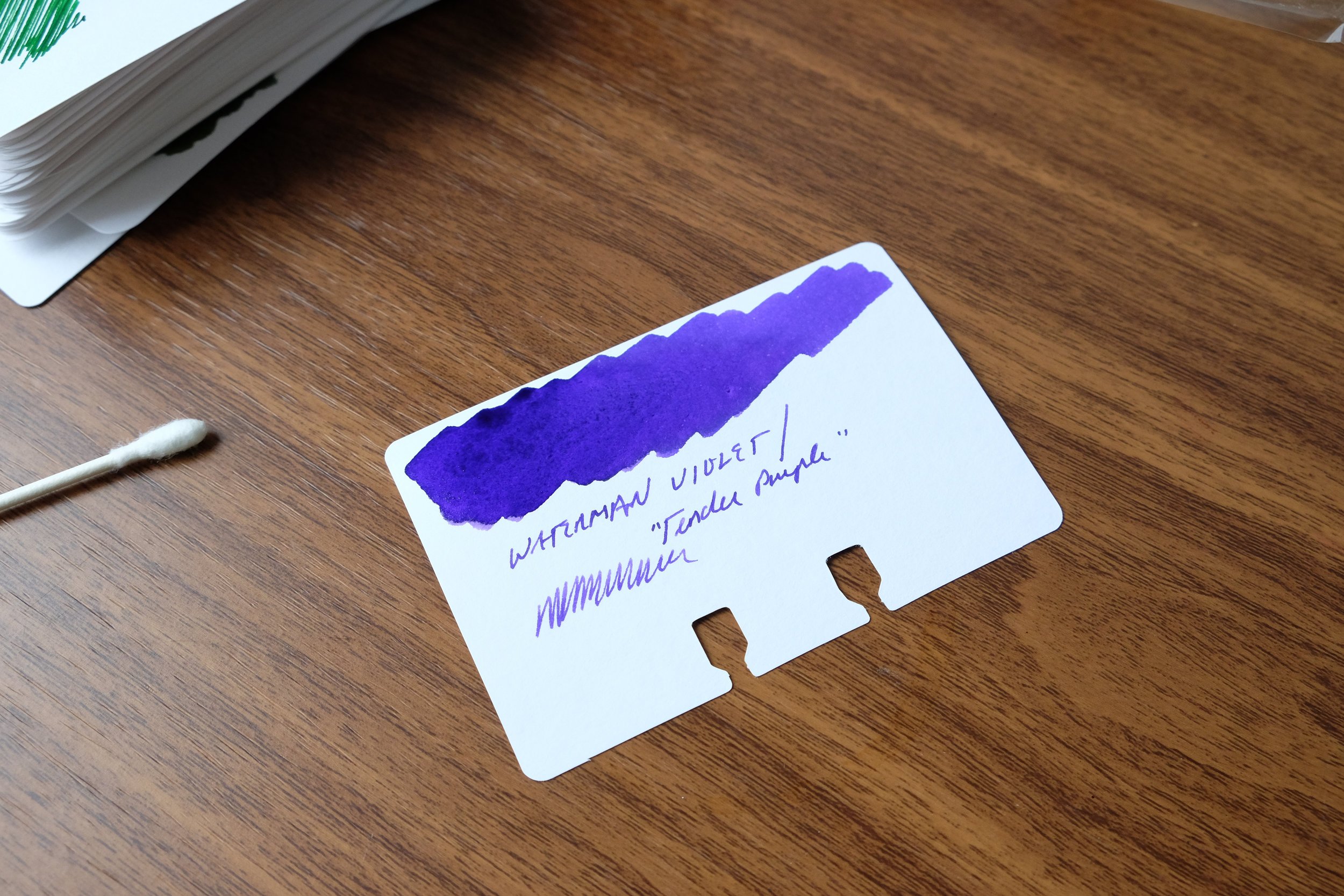
Purple: Waterman Violet. Not "Tender Purple" or whatever they're calling it these days. Violet. Be warned that of all the Waterman inks, this one has a tendency to stain, so be sure you don't mind your converter (or clear demonstrator) having a slight purple tint long-term. (Definitely do not use in light-colored celluloid pens.) That said, it’s one of the most vibrant purple inks out there, and when I want my writing to stand out, this is my choice.
Grey: Scribo Grigio. I've been on a massive grey ink kick over the past year, and I keep returning to Scribo Grigio. While some might argue with me on this point and call the ink more of a blue-black, I'm going with grey here and the blue tint is what makes it interesting.
Pink: Laban Aphrodite Pink. This final color is extremely difficult, but at the end of the day I have to go with Aphrodite. Some would say this isn't a pink ink at all, but the criteria here dictate that I have to stick with an ink that I've actually used over the past year. In the pink category, this is the clear winner.
Some of the aforementioned inks we sell directly in the T.G.S. Curated Shop, where we are running a Memorial Day Weekend Promotion (10% Off) with the code “SUMMER23” at checkout. Otherwise I have linked to retailers who are friends of mine. This post does not contain paid advertising or affiliate links.


