One Week With: The Noodler's Ebonite Konrad

For this week’s in-depth review I’ve chosen a pen that gets surprisingly little love from the pen blogosphere: the Noodler's Konrad.  This review is going to be fairly lengthy, so I’ll provide my preliminary conclusions up front for those of you who don’t want to read the background.

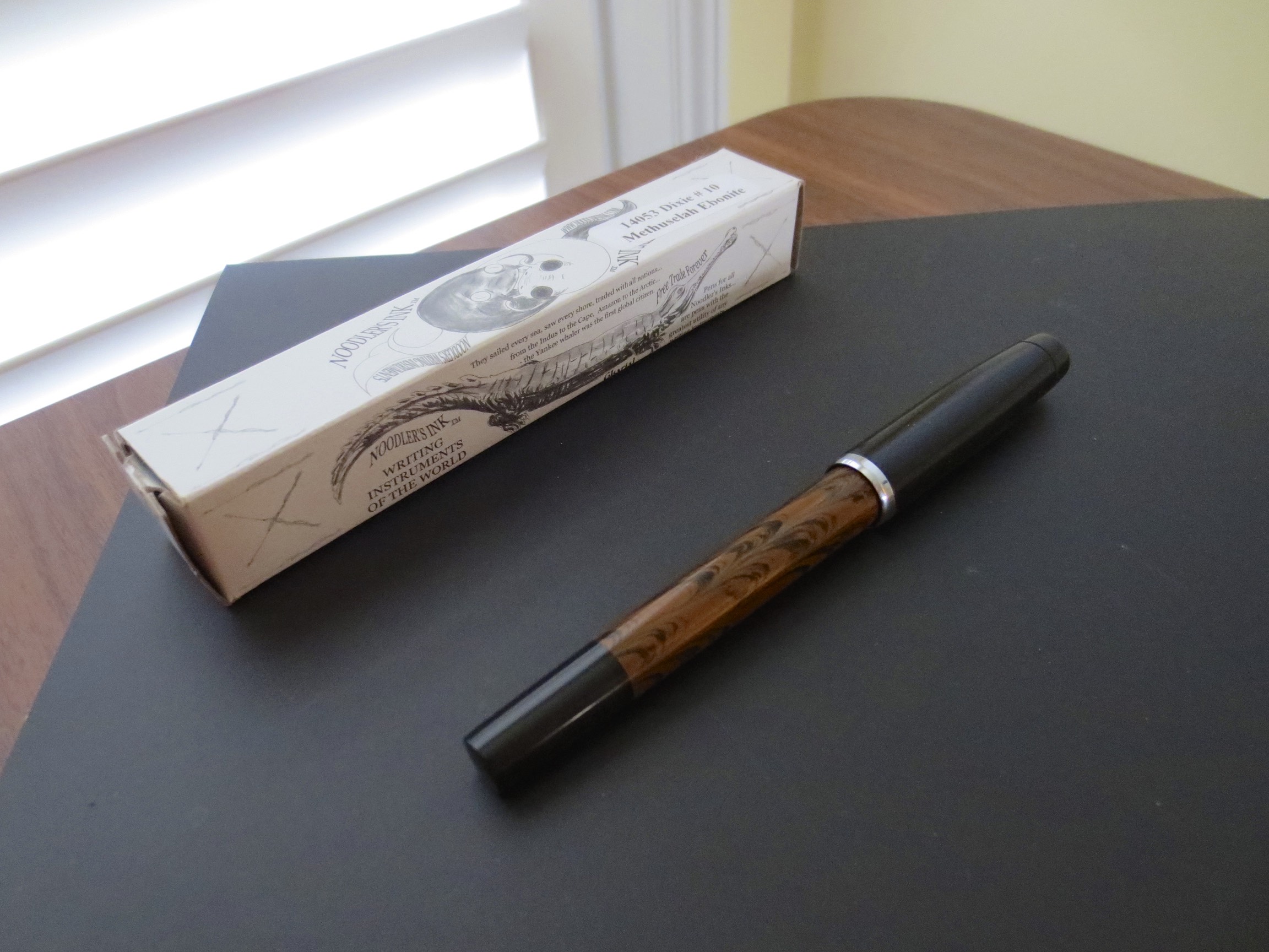
The Noodler's Dixie No. 10 Methuselah Ebonite, with standard Noodler's luxury packaging. 

The Noodler's Dixie No. 10 Methuselah Ebonite, with standard Noodler's luxury packaging. 

  • I really like this pen.  It’s a nice writer, flexed or unflexed, and a good buy for a pen with a piston-filling mechanism at the $40 price point.

  • I prefer the Ebonite version of the Konrad to the standard version because it’s larger and sits better in the hand, IMHO.  

  • The Konrad, like other Noodler’s pens, is customizable, with any No. 6 nib being swappable.  **If you are going to swap nibs on these pens, be aware that the nib that comes pre-installed with this pen has been heat-set and hand-tuned by Nathan Tardiff, so be prepared to tinker with the pen and the feed to get optimal performance from a substitute nib.**

  • If you want a mid-range pen that has some flex capability, or even just slightly more character than a TWSBI or a Safari, the Konrad is a solid choice.    

  • I received this pen free of charge for review purposes from our sponsor at Pen Chalet.  

A Brief History of Noodler’s Fountain Pens

Noodler’s pens have a somewhat controversial history.  The company first introduced in or around 2011(?) a bare-bones, entry level, piston-filled “resin” fountain pen with a fine/medium steel nib.  These initial pens were functional but known more for their knock-you-on-your-backside smell than anything else.  I purchased two of them for around $14 each when I was first re-testing the fountain pen waters, used them sporadically, and paid them forward via FPN or FP Geeks.  One of these pens was originally a clear demonstrator, which eventually mutated into a “violet” demonstrator after four hours of use as my “Baystate Blue” pen.  **Disclaimer—I no longer use Baystate Blue, but if you want to, I would strongly recommend devoting a single pen to this ink, unless you want to spend a lot of time cleaning your pens with bleach.**  These pens were nice little writers, and certainly functional, but too small for my hands.    

Noodler’s next introduced what until now has been my favorite of their pens, an ebonite “aerometric filler” in green and brown mottled ebonite with a nice medium nib.  You could remove the aerometric filler, which was essentially a glued-on press converter, and use the pen as an eyedropper.  This little pen made a good everyday user with its large ink capacity.  It sat on my desk at work for a year and a half filled with Heart of Darkness.  I wish that I still had this pen, and so far have looked in vain to find them on Ebay or Fountain Pen Network Classifieds.  I paid this one forward as well.

Noodler's steel flex nib.  Note the nib slit that runs the entire length of the nib.  

Enter the Noodler’s “flex pens.”  When these pens first hit the market, demand could only be called insane.  The original flex pen, now called the “Nib Creaper”, was an updated version of the original piston filler that included a steel “flex” nib.  Those of you who have ever played around with a Noodler’s flex pen know that they are nothing like vintage gold-nibbed flex pens.  These are steel nibs, manufactured in India, and feature a slit which runs from the tip of the nib all the way down to where the nib meets the section.  With no pressure, the nib writes what I would call a “Western fine” line, though when you “flex” the nib, you can get pretty decent line variation, up to a broad or so.  YMMV with these nibs.  I’ve written with some that barely flex at all, and others that make your writing look flat-out gorgeous.  All of these pens feature an ebonite feed, which is rare these days, and **generally** do a decent job of delivering sufficient ink flow to this nib.   

As mentioned, the initial run of pens were extraordinarily well-received.  Goulet Pens would get a shipment in, only to sell out in minutes.  Because the parts were manufactured in India, and hand-assembled in the United States by Nathan Tardiff (owner/sole employee) of Noodler’s, months would pass before there was a re-stock.  While the time between re-stocks is better now, I believe Nathan still hand-sets and heat-sets each feed and personally tests each nib.

The pen that I’ve been using for the past week, the Noodler’s ebonite Konrad (Dixie No. 10 Methuselah Ebonite version), is the third iteration of the Noodler’s flex pen.  A year or so after introducing their first flex pen, Noodler’s released the Ahab, which was billed as a larger flex pen with a large capacity pump filler that could be removed to create an eyedropper with a massive ink reservoir.  (9ml of ink, anyone?)  I will save discussion of the Ahab for another time, because I want to re-review this pen now that early quality-control issues supposedly have been resolved.  BUT, in full disclosure, from the outset many Ahab purchasers experienced poor ink flow (in some instances the pens would not start at all), stuck converters, and the ever present very strong smell.  The flow issues could often be fixed by cleaning the feed—or for the intrepid, carving an additional channel into the ebonite—but retailers sometimes made the mistake of marketing what was intended to be a “tinkerer’s pen” to fountain pen newbies, who were overwhelmed. 

The Konrad is born

Enter the Konrad.  **Disclaimer—I don’t have one of the standard Konrads.  This review is based on the Ebonite Konrad, which is a more expensive pen at $40, as opposed to the $20 price point of the standard Konrad.**  The Konrad is probably the most “accessible” Noodler’s pen made so far, in that it is a large-capacity piston-fill fountain pen (no pump fillers) that is fairly traditional looking, and because I understand Noodler’s made an effort to address the Q.C. issues that plagued the Ahab by paying closer attention to the feeds and heat-setting the feeds to the nib to ensure better flow.  

Build Quality and Design

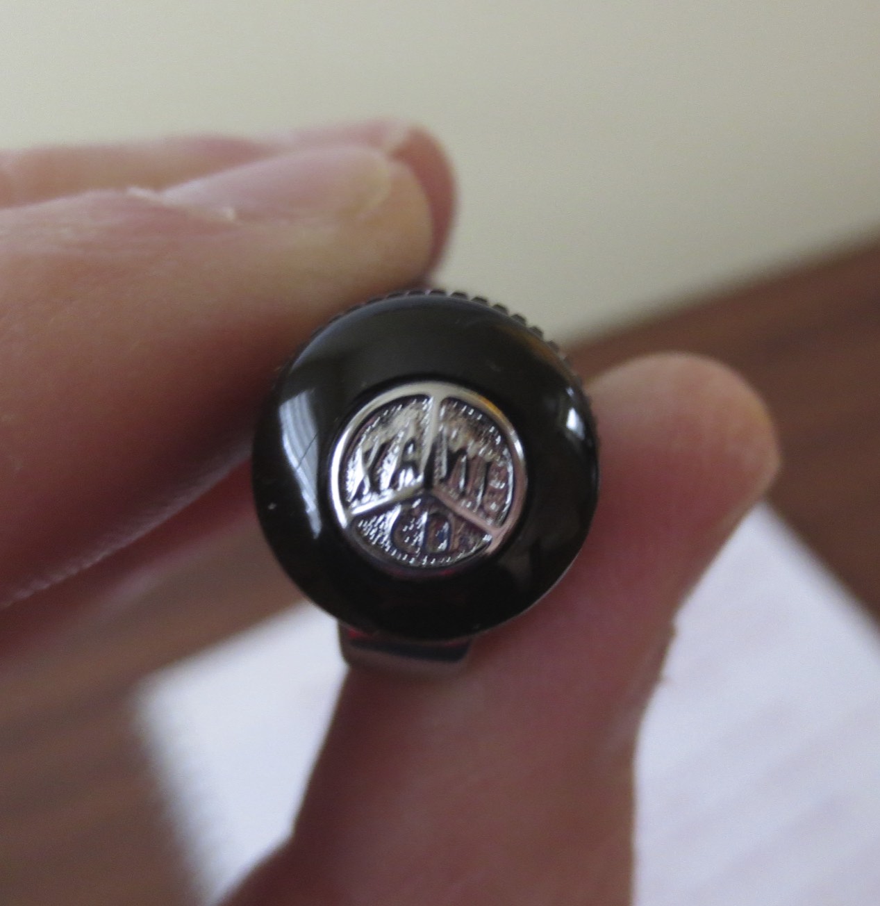
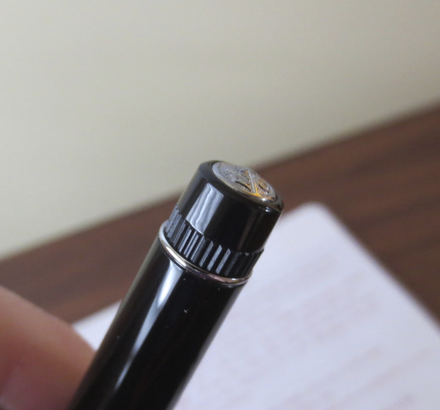
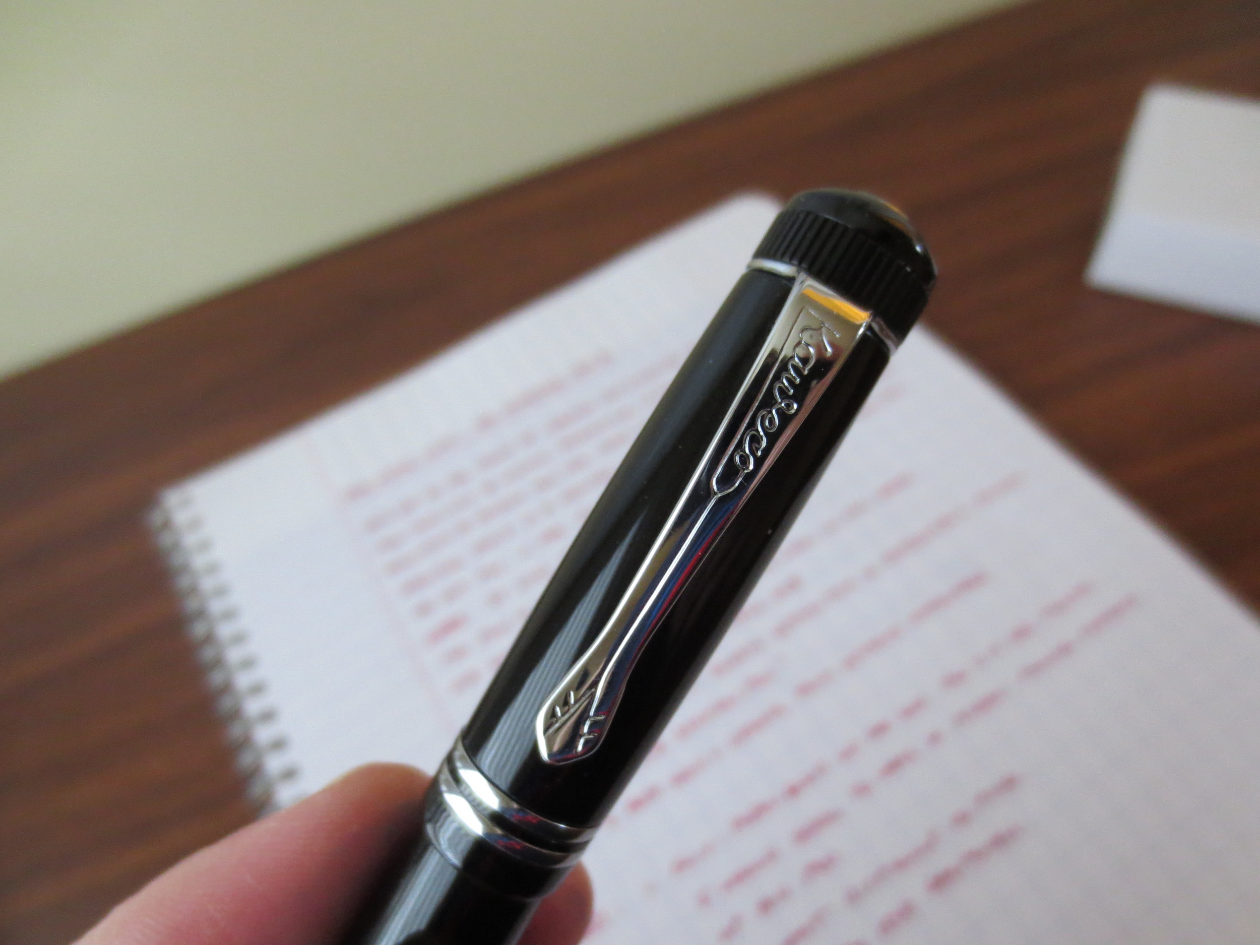
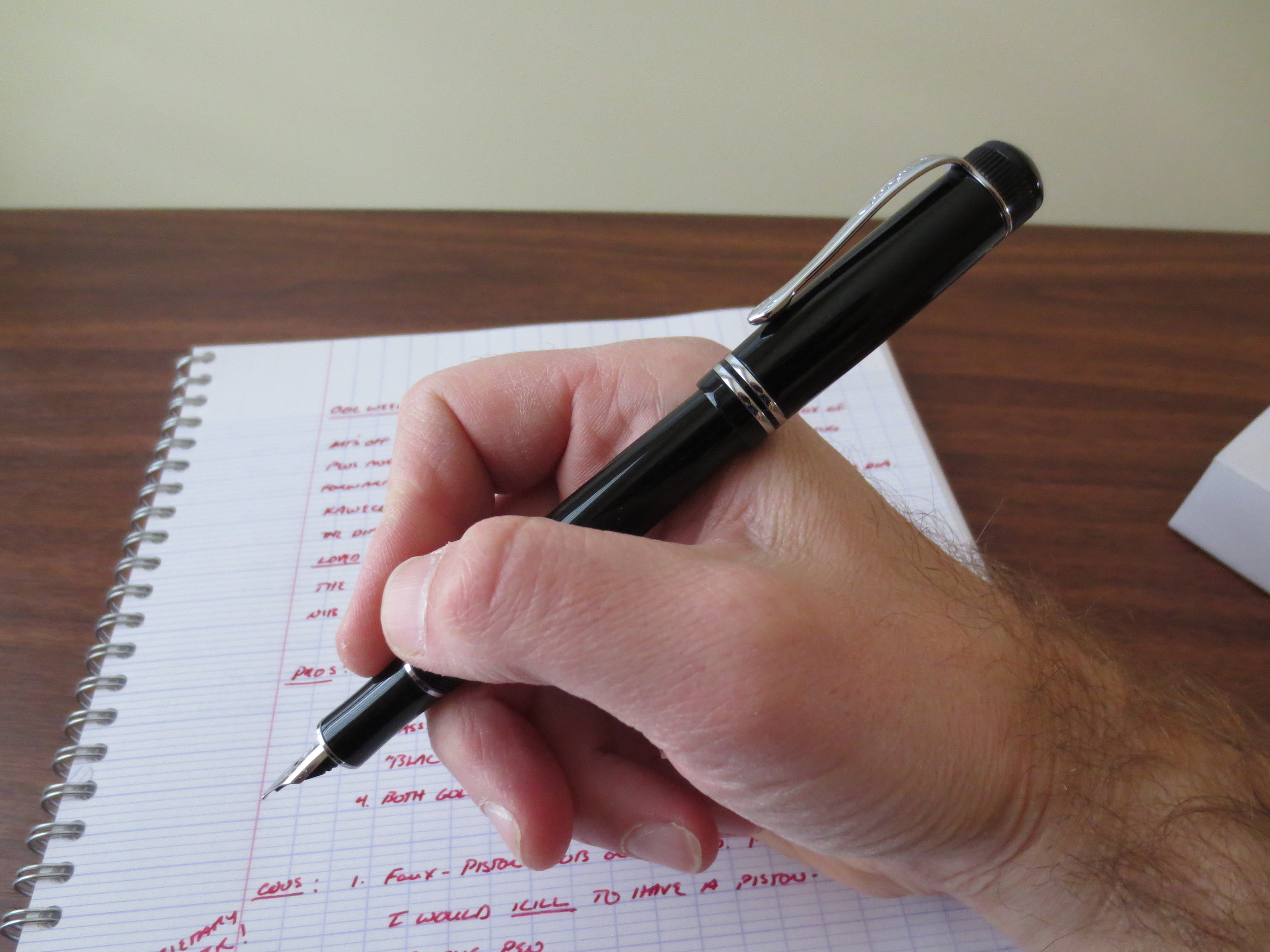
The build quality of the Konrad is pretty good for the price point.  The standard model is a resin/celluloid variant that is made in India, and they come in a wide range of colors with Noodler’s typical “descriptive” names (“Hudson Bay Fathoms Blue?”).  I particularly like the clear demonstrator models, and may pick up a few.  The pen I have is made out of ebonite, with a black cap, section, and blind cap and a brown mottled barrel.  There is an ink window that you can use to check the pen’s ink supply.  Ebonite pens are incredibly durable—it’s the same material used to make bowling balls, so I’m sure that the clip/nib/piston mechanism will wear out of this pen long before the body of the pen breaks down. 

Noodler's Konrad ink window, barrel and section. 

In a nod to vintage pens, Noodler’s has created a two-part piston mechanism, where the user removes the blind cap entirely to access a plastic piston knob that is turned to refill the pen.  The only other pen company I’m aware of that features this type of piston filler is Delta.  

Noodler's Konrad piston mechanism with blind cap removed. 

At what you are paying, this pen is solidly constructed.  There are machining marks here and there on the pen body, and my cap came with a slight knick under the clip, but it doesn’t bother me.  I would probably advise, however, that at $10 more, if you are a true fountain pen newbie who wants to minimize having to tinker with your pen, and don’t care about “flex,” you are probably better off going with TWSBI (who, be advised, has their own quality issues).  

Konrad posted

Konrad unposted

The “Flex Nib”

The “flex” you can get from these pens is variable.  As you can see in the writing sample below, this particular pen gets decent “flex” from the nib, and makes my cursive handwriting look quite nice.  In order to get “vintage flex” line variation many people are looking for, you will either have to press very hard on this nib or adjust the nib and feed (see below).  This pen writes so nicely that I’m not going to tinker with it further, and am perfectly happy with the amount of flex I can get out of it.  

You can adjust the feed by moving it further away/closer to the tip of the nib in order to increase/decrease the amount that the steel nib will flex.  I did this with an Ahab a while back, and it’s not necessarily easy to do and get right.  I’d advise against it unless you are prepared to tinker for an extended period of time. 

Konrad writing sample with Iroshizuku Asa-Gao, on Clairefontaine Seyes-ruled paper. 

Other Notes

The Konrad, like all Noodler’s pens, is designed to be customizable, and is compatible with any No. 6-sized nib.  If you don’t like the flex nib that comes with the pen, Goulet Pens offers their own line of compatible replacement nibs in a full range of tip sizes, including 1.1 and 1.5mm stub nibs.  Noodler’s themselves sell standard F/M/B nibs that fit the Konrad and the Ahab.  Of course, you can also find a vintage 14k gold No. 6 nib if you want to go that route.  Be advised that once you swap nibs, the feed will no longer be heat-set and tuned, so you may have to tinker with the pen to get optimal performance.  

In conclusion, this is a nice pen and I’m very happy with it.  As you often find with lower-priced pens, it is less temperamental and writes more consistently than some of the more expensive pens in my collection.  You can purchase this pen from Pen Chalet.  I received this product free of charge for review purposes.

Pen Review: Zebra Sarasa Clip

I’ll be the first to admit, I’ve been a lazy pen blogger lately.  I’ve let my stockpile of pens and pencils “to review” accumulate to an insane degree, so I have to get on it.  I’ve been stuck in a cycle of indecision, going back and forth over what direction I want the blog to take, what kind of stuff I want to focus on, etc., but at the end of the day, this blog is more or less a reflection of my personal usage and writing habits, and I use pretty much anything I have at hand as long as it offers a decent writing experience.  

So, back to where I’ve been meaning to start since the beginning.  My office stocks Zebra Sarasas as the “supply cabinet” pen.  The Sarasa is an unusual choice, but it’s been there for years, ever since I’ve joined my current company back in 2008.  Prior to that, there was a stockpile of custom-printed Bic rollerballs with our firm logo on them (which were actually pretty decent, and I still grab them when I can find them), but at some point the choice was made to move to the retractable gel pens in .7mm tip size.  But why the Sarasa over the Pilot G2, or the Uniball Signo 207, its two primary competitors?  I’ve never been able to get an explanation for this, and I’ve been left to assume that someone who worked in human resources must have really, really liked the Sarasa (or got a really, really good deal on 2 million of them seven years ago).  

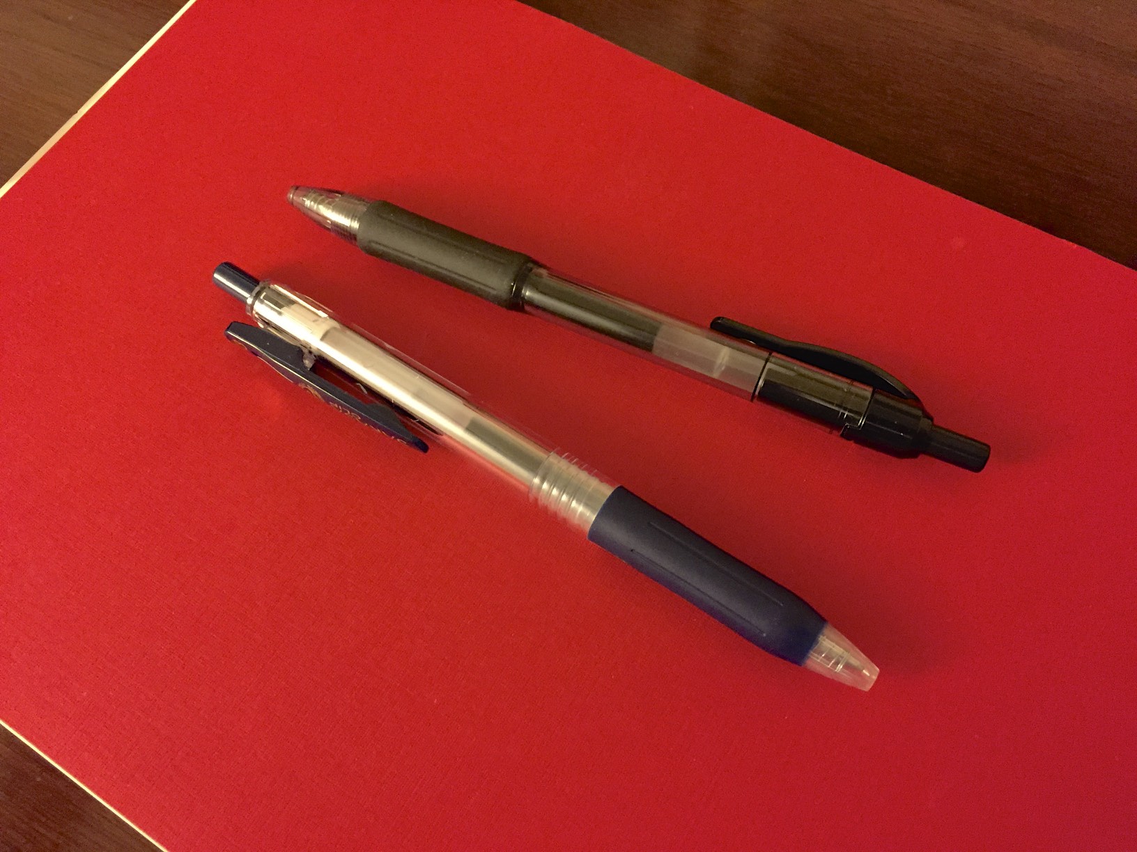
My nemesis in black. 

My nemesis in black. 

The Sarasa is the reason that my pen hobby/habit reemerged with a vengeance a few years ago.  I hate those things.  With a passion.  I’ve written about this before, when I reviewed the Pilot G2, but the .7mm Sarasa blobs and smears to a degree that makes it nearly unusable to me.  The blue is worse than the black.  The red is ok, and I like red ink, so on that rare occasion that I’m forced to grab something out of the supply cabinet, and I can’t find a pencil, I’ll grab a red Sarasa.  

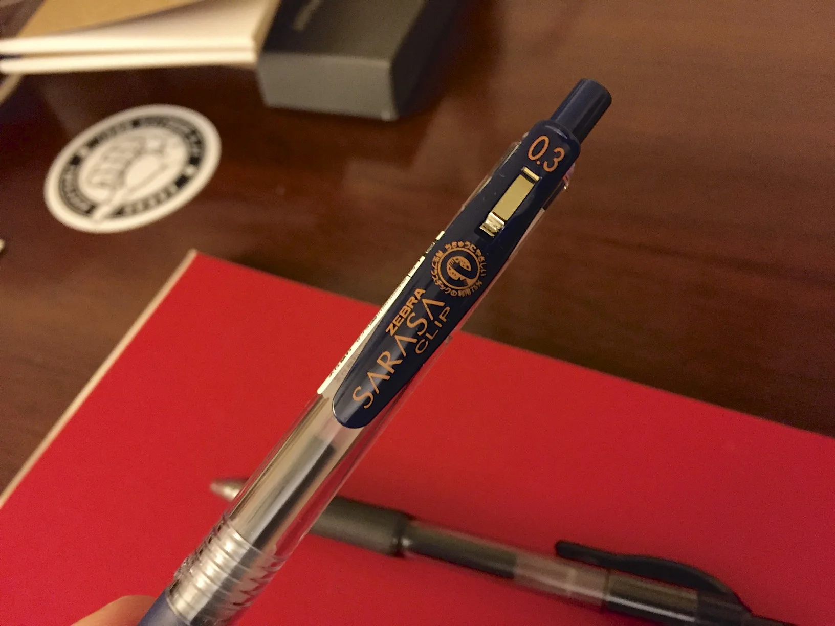
The Sarasa Clip offers a completely different experience.  The name is also fitting. 

The Sarasa Clip offers a completely different experience.  The name is also fitting. 

So this general dislike of the Sarasas is the reason I’ve been reluctant to pick up another highly regarded Japanese gel pen, the Zebra Sarasa Clip, which I finally caved and purchased this past weekend during my visit to Kinokuniya in New York City.  Here are my takeaways: 

The Sarasa Clip is a completely different pen.  Build-wise, most people would consider this to be a “lower-end” pen than the standard Sarasa.  The Clip has a slightly more slender body, the knock on the pen is looser, and the grip section of the pen has less cushion.  It cost me less than $2.  BUT, the refill is much better, in my opinion.  It has none of the blobbing and smearing that I can’t stand about the general Sarasa.  Some of this is due to my personal preferences as to tip size:  the Clip comes in a .38mm tip size, which puts less ink on the page, and the less ink on the page, the less blobbing, smearing, etc.  But part of it is due to the quality of the refill itself.  I’m not a huge fan of the Pilot Juice, even in the .38mm tip size, and I like Pilot pens.  There’s something about certain refills, and their varying ink formulations, that make them more or less pleasurable to write with.  The Clip passes the test.  

The Sarasa Clip has a slightly narrower grip section than the standard Sarasa. 

The Sarasa Clip has a slightly narrower grip section than the standard Sarasa. 

Another size comparison.  That clip is friggin' huge.  And it's also spring loaded, meaning that it will actually stay put. 

Another size comparison.  That clip is friggin' huge.  And it's also spring loaded, meaning that it will actually stay put. 

The one issue some may have with the Sarasa Clip is, well, the clip.  It’s huge, and has a massive logo on it, which is written in Japanese characters that I have zero ability to translate.  It’s not something that would stop me from using the pen, but I can see how it might look disproportionate to the size of the pen.  It is spring-loaded, however, unlike its brethren, so the clip will stay put.  

EDIT:  I've added a comparison of writing samples from various blue-black and blue gel pens and hybrid gel/ballpoints.  

EDIT:  I've added a comparison of writing samples from various blue-black and blue gel pens and hybrid gel/ballpoints.  

The Clip is available in a huge range of colors.  You can purchase them from Jetpens (link here), as well as at Kinokuniya if you are in New York, San Francisco, or other cities with a Kinokuniya or Maido location.  Another bonus:  the Clip is cheap.  I think I paid $1.75 for this one, compared with $3.95 for a Hi-Tec-C.   (Jetpens sells the Clip for $2.20, last I checked, the Hi-Tec-C for $3.30, and the Signo DX for $2.50.)

One Week With . . . The Pilot Metropolitan

As I announced yesterday, The Gentleman Stationer is giving away a Pilot Metropolitan in honor of Fountain Pen Day, courtesy of Jetpens.  I announced the giveaway first to ensure that anyone interested had a full week to participate, even though I haven't gotten around to posting my actual review of the Pilot Metro until now.  

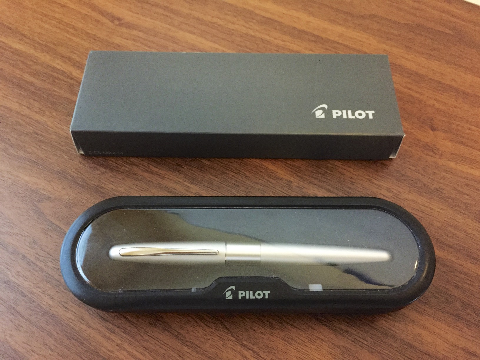
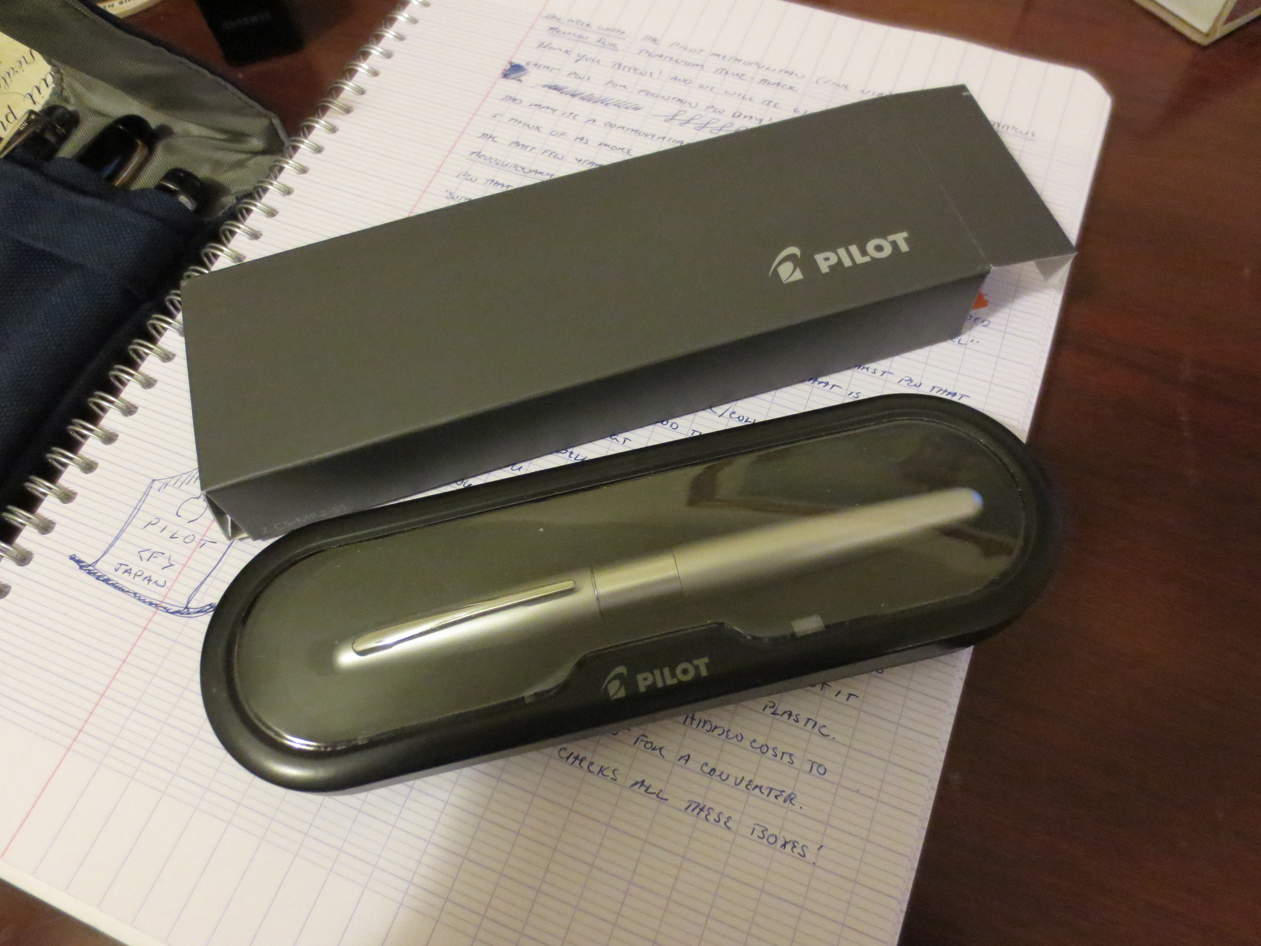
This is the Pilot Metropolitan that The Gentleman Stationer is giving away in honor of Fountain Pen Day.  See yesterday's post for details! 

The Pilot Metropolitan is an excellent pen and I'm not sure I can sing its praises enough.  It's not that the pen doesn't have shortcomings--it does.  The grip section has a somewhat awkward "step-down" from the barrel to the section that can cause problems for those who grip their pens high.  From an aesthetic perspective, some of the new "animal print" patterns (purple leopard print?) are a little out there.  But at the end of the day, I believe this is the single best entry level pen on the market, and one of the best workhorse "daily user" pens available.  I spent this past week using the Metropolitan (plain silver, fine point) exclusively.  Here are my thoughts.  

Entry Level Fountain Pens

I bought my first fountain pen when I was living in France in 2000-2001.  I was a university student at the Sciences-Po in Strasbourg, and the only one in all of my lectures who was writing with a rollerball (a Pilot V5, my then pen of choice).  After a week or so of watching my new classmates write elegant cursive on their Seyes-lined paper and change their ink cartridges to switch back and forth between ink colors I had never seen, I was intrigued enough to stop by the stationery store on my way back to my apartment and pick up three student-grade fountain pens and what must have been a half gallon plastic bag of generic blue-black ink cartridges.  I no longer have any of those pens, but I'm pretty sure they were a Waterman Kultur, a Sheaffer No-Nonsense, and a generic Stypen.  With the lone exception of the Kultur, these pens were horrible writers, with dry, scratchy nibs and flow issues.  The Stypen leaked and ruined at least two pairs of pants.  But I was hooked. 

I mention this story because I probably spent twice the price of a Pilot Metropolitan on those three cheaply made pens, only one of which worked *reasonably* well, and none of which I ever could have used in the professional environment I work in today.  It's possible that if the Metropolitan had been available, and I had bought that pen as a student, I would still be using the same pen today, and I certainly would have been spared five years of rotating through handfuls of cheap fountain pens looking for something that was halfway reliable and wouldn't break the bank.  I also can't help but think that if I caught the fountain pen bug using the "first pens" I had available to me, how many people might be converted if they had the opportunity to test the waters of the fountain pen world with an attractive, reliable pen like this one.

Build

This pen is a workhorse.  I have two Metropolitans in my collection:  a plain black pen with a medium nib, and a plain silver pen with a fine nib.  While the medium is probably my favorite for everyday writing, I broke out the fine this week for review purposes.

The Pilot Metropolitan is a classic-looking pen that performs well as a daily user. 

The body of the pen is predominantly plastic, but it has some heft to it, so I suspect there is a brass weight in the barrel.  The plastic is thick and not brittle, unlike some pens billed as "beginner" or "entry level" fountain pens.  It feels sturdy.  It also doesn't scratch easily.  I've tossed these things into various bags, pockets with keys, car glove boxes, etc. and they still look good as new.  The clip is nothing special: It's not spring loaded, but it's tight, and the pen definitely stays clipped to wherever you keep it stored.  Finally--my favorite part--the cap is a "click" or "slip" cap that pops on and off with a satisfying "thunk" and stays on, with no wiggle.

The converter that ships with the Metropolitan is nothing fancy, but at least you don't get stuck paying an extra $5 for the privilege of filling from the bottle (which is supposed to be economical).  

The Metropolitan is a cartridge/converter pen that ships with a converter installed.  The converter is pretty basic:  it's a low-end squeeze converter that's nothing fancy but gets the job done.  I believe it's the same one that ships with the Pilot Parallel calligraphy pens.  The pen also comes with a single cartridge of Pilot Blue or Blue-Black Ink (I can't tell by looking at it, and I haven't used it).  Like most Japanese companies, Pilot's cartridges are proprietary, so be warned that if you want to use cartridges to refill this pen you can't use the standard international model.  

Design

The Metropolitan sports a classic streamlined design.  In its most basic color scheme (i.e., those not involving animal print), it's a pen that won't turn heads at the office, for those of you (like me) who get tired of eye rolls whenever you break out something that doesn't resemble the G2 or Sarasa or Jotter or whatever other "nice pen" your coworkers are carrying.

The Nib

Translucent Pilot feed. 

The Metropolitan uses the same nib as the Prera and other midrange Pilot pens. 

Unlike many (if not most) pens at this price point, the Metropolitan sports a smooth stainless steel nib that has none of the scratch first-time fountain pen users sometimes complain about.  The nibs on the two Metros I have are actually smoother than many gold nibs I own.  They are stiff as nails--don't be expecting any flex or significant line variation--but these pens aren't intended to write Copperplate or Spencerian.  I've heard the nibs are swappable with the Prera and other mid-range Pilot pens, but I have no experience doing that and can't recommend it one way or another.

Packaging and Price Point

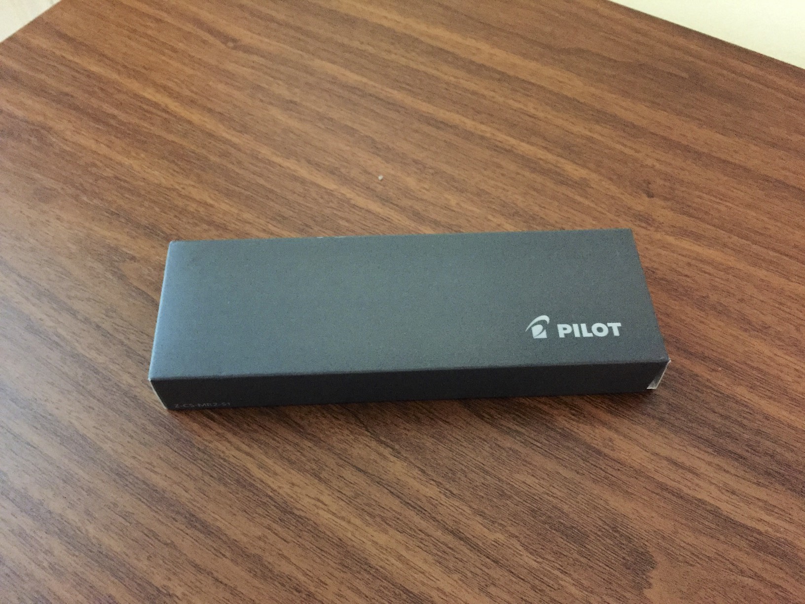
Considering the Metropolitan is priced at a whopping $15.00, the packaging on the Metropolitan easily exceeds its competition.  It comes in a fairly nice clamshell box enclosed in a cardboard sleeve.  Definitely more than I would expect, considering that the Pilot G2 Pro is only slightly less expensive and doesn't come in a box at all.  But moving back to the price point:  $15.00.  I'm not sure there is anything on the market that even approaches a pen of this quality for $15.00.  Some people will say that you can get a Jinhao or another Chinese pen for $5 or whatever on Ebay, and, yes, it's possible that if you take that leap of faith you might receive a pen that writes as well as a Metropolitan, but the consistency won't be there.  I've bought those very cheap pens before, and for every excellent writer there are five that won't work at all and are a complete waste of money.  (Do the math:  buy 6 pens to get one decent writer = 6 x $5.00 per pen = $30.00).  Save yourself the headache, buy the Metropolitan and you're sure to get something that writes, and writes well.

DISCLAIMER:  While the pen that I used to write this review comes from my own personal collection, JetPens is providing the Metropolitan for the Fountain Pen Day Giveaway free of charge.  If you aren't lucky in the giveaway, Jetpens currently has the Metropolitan listed for $14.50 (plain black, fine nib), which is the best pricing I've seen on the pen.  (LINK HERE)  And if you spend $25 or more you get free shipping!      

Handwritten review.  The ink is Platinum Blue-Black, and the paper is Clairefontaine French-ruled.