Turquoise inks started appealing to me after I read a review somewhere of one of the "classic" vintage inks, Sheaffer's original Peacock Blue. Somewhere along the line, the ink was renamed simply "Turquoise," probably after Sheaffer's U.S. ink factory closed and production was moved to Slovenia. I've never had the opportunity to try the original Peacock Blue, but I am a huge fan of Sheaffer's Turquoise.
One major disappointment when Sheaffer revealed their new "modern" ink line was that they had done away with their traditional "inkwell" bottle in favor of this smaller, triangular bottle that can make it more difficult to get at all of the ink, especially if your pen has a larger nib.
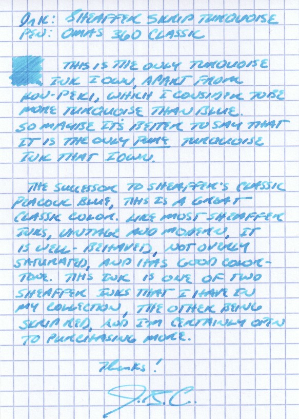
For lack of a better way of expressing myself, I would characterize Sheaffer Turquoise as having a good, pure turquoise tone. It's got enough blue in it to make the ink dark enough to be used as a regular writing ink, yet not so heavy on the dark blue or green that would render it more teal than turquoise. Some people might hesitate to do so, but I have no issue using this ink at work.
For some reason (maybe the green background), this photograph seems to be a more accurate representation of the actual color I see on a day-to-day basis. Depending on the pen and the paper, it can look very similar to Iroshizuku Kon Peki.
I picked this ink up at the D.C. pen show a couple years back, when I sampled several turquoise inks at the ink testing table. I liked this one the best. I've found that in order to get good shading using this ink, you should use a broader nib. Generally, it's a very well-behaved ink that doesn't feather or bleed, even on the cheapest-of-the-cheap office paper that I'm forced to use at work. I've even been able to use this ink on Field Notes paper (with a medium nib!) without feathering, depending on the pen. Some people complain that Sheaffer's selection of colors is boring, but I disagree with that characterization. The selection of colors may be "standard," in the sense that the have the traditional blue/black, blue, green, black, brown, red, and purple offerings, but there's something to be said for a company sticking with what it knows, especially where the result is this good. (Side note: I've heard that Sheaffer revamped their Slovenian-manufactured ink formulas a couple years back to make the colors more vibrant, among other things, so if you have bottles that are more than one or two years old, of if your merchant's stock was old, YMMV.) Personally, I've never worried about staining, clogging or other maintenance issues using these inks. A great review of Sheaffer's entire line of inks can be found on Glenn Marcus's blog here.
I also have a bottle of Sheaffer Skrip Red, a classic, as well as a few bottles of vintage Skrip Washable Blue. Reviews of those forthcoming.


