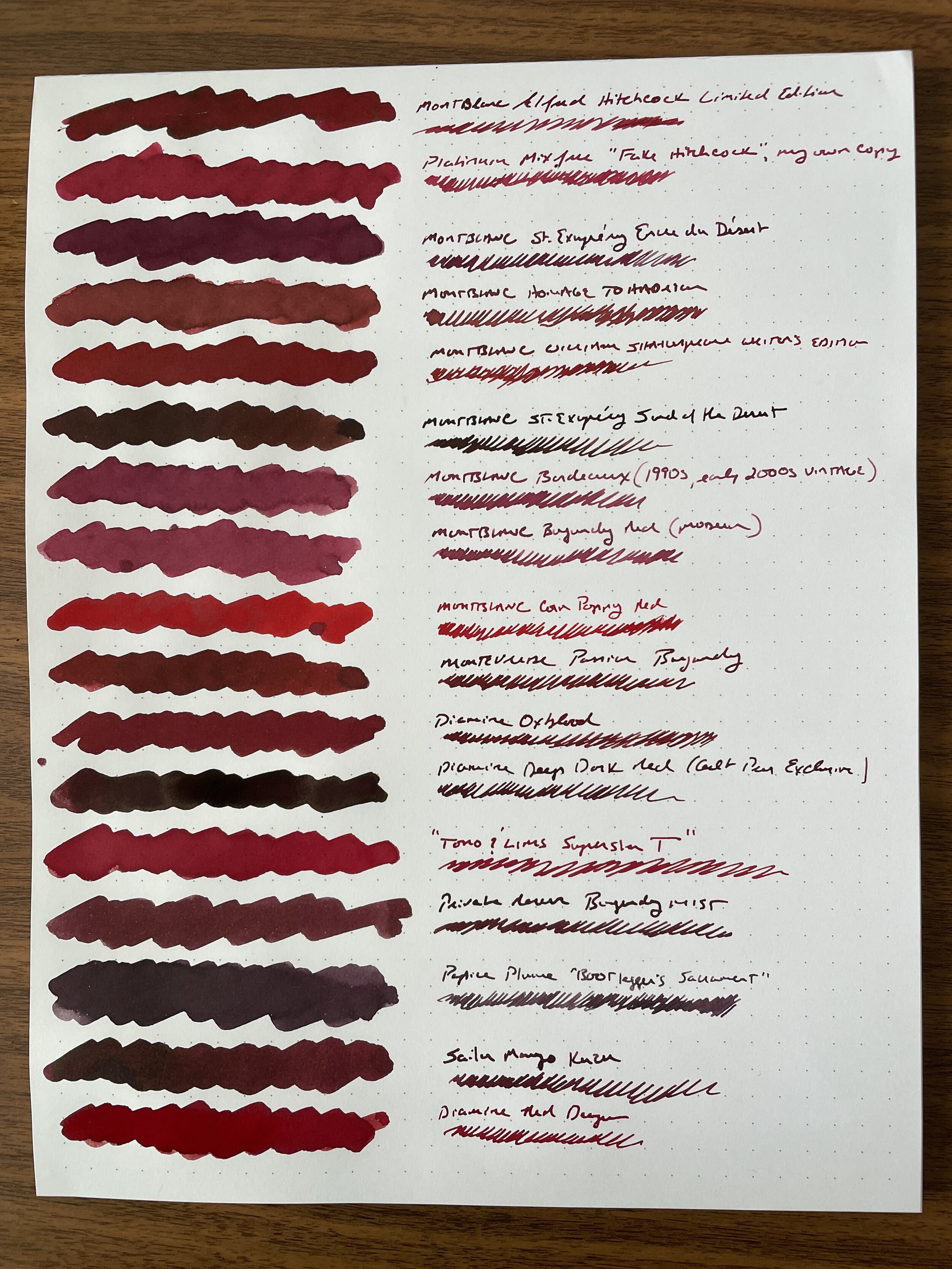
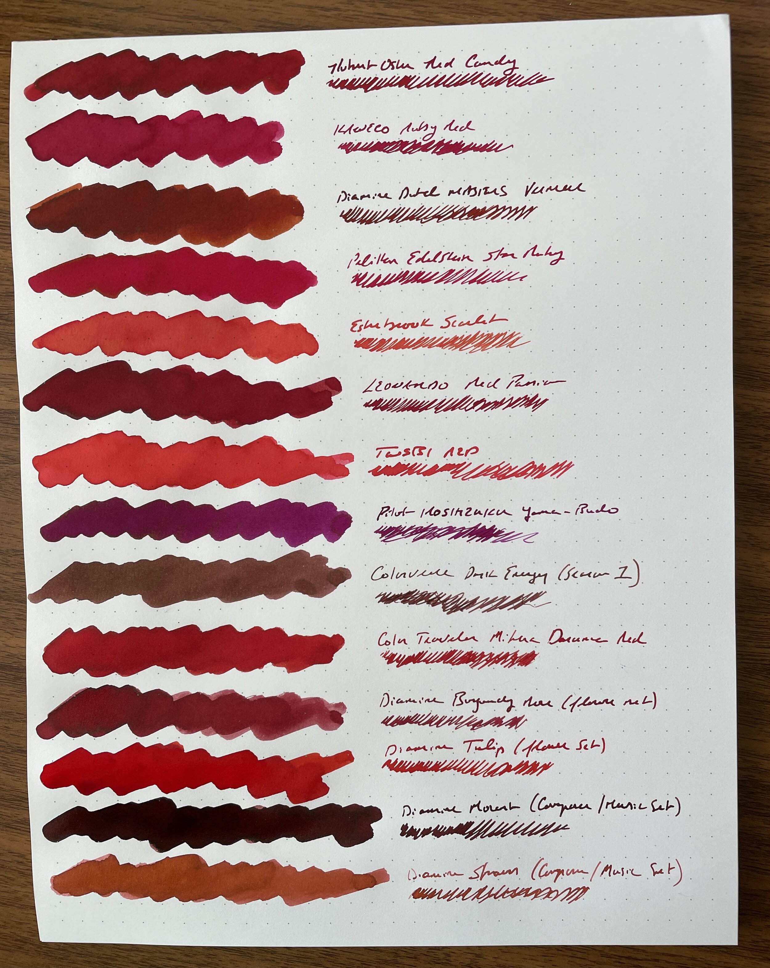
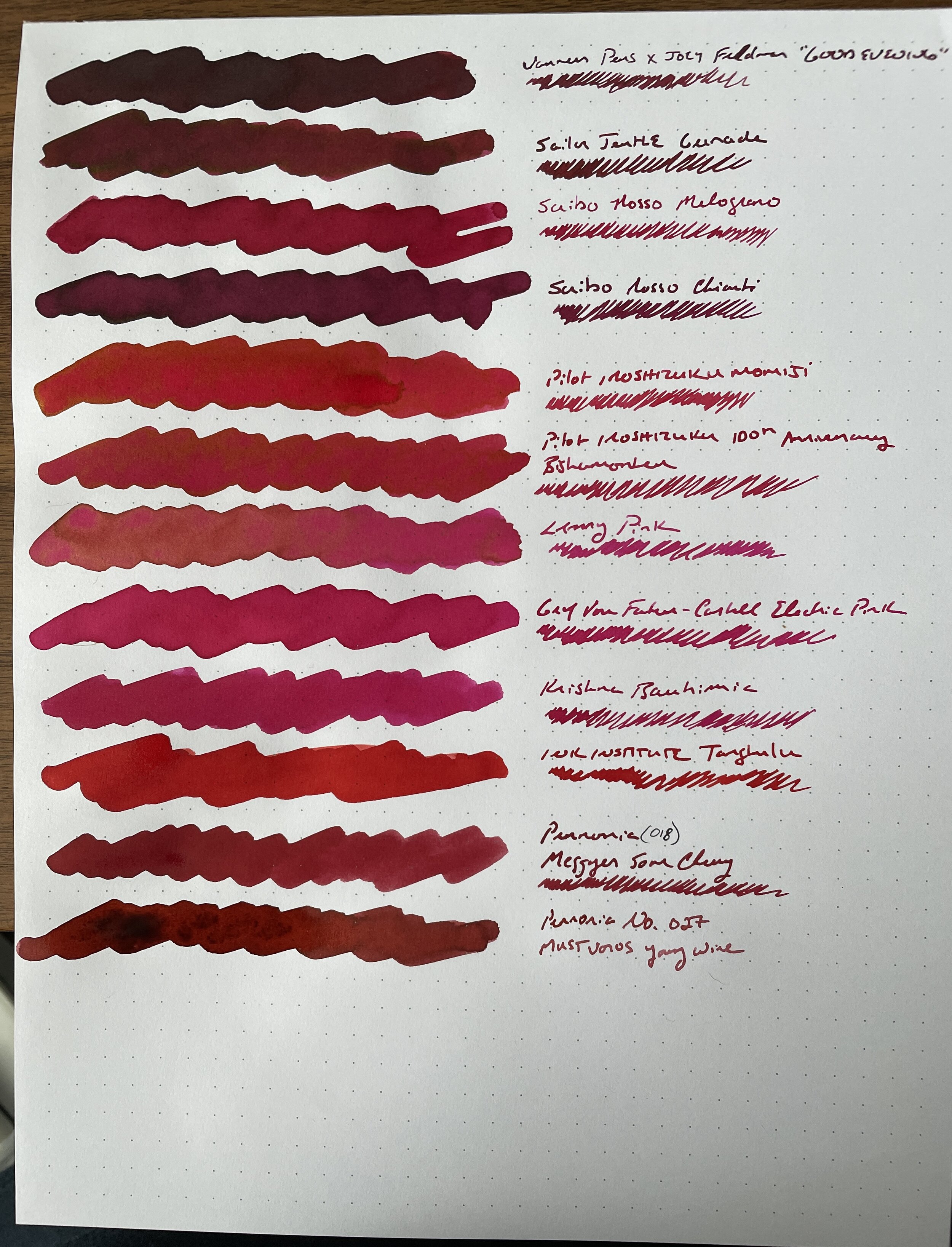
My stationery “collection” doesn’t really have a central theme, in that it’s not built around a specific brand. Rather, I tend to accumulate what I like to use, which has given rise to what I refer to as “mini-collections.” The first of these that I wrote about includes several models of the Parker Sonnet, what I consider a vastly under-appreciated pen. The second is on the ink side, which revolves around a rather large stable of red inks, mostly dark reds and burgundies.
Why Red Inks, You Might Ask?
It’s pretty simple. Dark red is just one of my favorite colors. It’s no coincidence that one of the first bottled fountain pen inks I ever purchased was Noodler’s Antietam, that the main color scheme of the T.G.S. website is burgundy and black, that I review red pens whenever I have the option, and that both of the exclusive editions I’ve released through the shop include red somewhere, whether it be the “Aged Red” Penwell or the recent Sunderland mk1. As you can imagine, I have accumulated a LOT of red ink over the years.
I don’t subscribe to the stigma that writing in red ink is somehow too loud, or should be considered “angry” or offensive. There are various shades of red, and I’ve always enjoyed a darker burgundy or red-black for everyday writing. My favorite, of course, is Montblanc’s legendary Alfred Hitchcock, a limited edition ink that many have tried to duplicate over the years. My personal “grail quest” hasn’t necessarily involved a pen, but rather finding a suitable replacement for this favorite ink, given that I only have half a bottle remaining. What I’ve never done, however, is swab ALL of my current stable of red inks and compare them side-by-side, to get a sense of whether I’ve accomplished my goal (or even whether I still want/need to).
The Process for Standardizing My Ink Samples
Taking inspiration from Anthony over at UK Fountain Pens, I wanted to use a menu-style format for the comparison with a simple cotton swap + dip pen writing sample combination, on bright white paper from a Write Notepads dot-grid memo pad. I chose this paper because it showcases the ink color quite well, including any shading and sheen, and absolutely will not feather or bleed even with most very wet ink swabs. The whole process took me approximately three hours on a Saturday, and I wound up with three sheets containing 43 different red inks. I laminated these sheets for posterity, and plan on doing similar comparisons with other ink colors in my collection.
Takeaways from My Red Ink Collection, Including Replacements for Hitchcock and Other Cult Inks
I’ve spent a few days thinking about this, and there’s a lot to unpack here, not least that I have more red ink than I can ever use in my lifetime, including a lot of similar shades. Here are my takeaways.
Hitchcock Replacement. So far, no one has been able to come up with what I’d consider a true match. In terms of reasonably priced “everyday writers,” both Diamine Oxblood and Monteverde Passion Burgundy are very close. Vanness and Joey Feldman collaborated on “Good Evening,” an attempt to develop a similar shade of dark red, but I find it to be a touch darker (though still a great ink). The trouble with matching Hitchcock is that the color tends to look much different in wet writers than it does in narrower nibs. I managed to come up with a Platinum mix-free combo that looks very similar in a fine or medium nib writing sample.
Other Matches for Limited Edition or Discontinued Montblanc Inks. Montblanc makes excellent inks, but their best colors tend to be limited or special editions that are made for a year or so and then discontinued. When I was live-posting this project on Instagram in real-time, I received questions about potential matches for Corn Poppy Red, William Shakespeare, and Bordeaux (the predecessor of “Burgundy” in the standard lineup). For Corn Poppy Red, consider Color Traveler Mihara Daruma Red. For William Shakespeare, consider Leonardo Red Passion or Robert Oster Red Candy. And while I don’t think the old Bordeaux is that far off from current Burgundy (maybe slightly darker), Diamine Burgundy Rose (from the “Flowers” set) and Pennonia No. 27 “Mustvoros Young Wine” are close.
My Overall Favorite Red and Burgundy Inks for Everyday Writing. While this category keeps changing, since I’m constantly finding new shades that interest me, I’ve also rediscovered a bunch of inks in my collection that I had forgotten about. The ones that basically leapt off the page were Leonardo Red Passion (Leonardo makes exceptionally good but under-appreciated inks), Montblanc Corn Poppy Red, and Robert Oster Red Candy. You will likely see more of these in my rotation in the future.
I’m Not Going To Use Certain Colors and Need to Purge Some Ink. It’s been over a year since my last ink sale, and I need to let 10 or so of these bottles go. I don’t use pink inks or reds that lean heavily pink, including many of the Pilot inks other than Iroshizuku Yama-Budo. Now that I have these inks swabbed for posterity on a laminated sheet, there’s no need to keep them around solely for comparison purposes. As always, Patreon subscribers will get first crack at whatever I decide to sell off, via the Patreon Sale page, and if anything’s left it will move over to the “Gently Used” stationery page, which is separate from the T.G.S. Curated Shop but can be combined with shop orders for free shipping purposes.
This was a highly satisfying project, and as I mentioned, I plan to repeat with other colors in the hopes of identifying my favorites, (re)discovering some hidden gems, and letting go of a bit more excess. Stay tuned for more fun! If anyone is interested in viewing these sheets in person, I will bring the color sheets with me to the D.C. Pen Show, where I will be behind the Vanness Pens table.
Disclaimer: This post does not contain paid affiliate links. Going forward, T.G.S is supported entirely by purchases from the T.G.S. Curated Shop and the T.G.S. Patreon Program, which offers access to online meetups, exclusive discounts and pre-orders, and more!


